‘Adding value to each project
gives a sense of joyfulness,
built on strategic thinking and
heart-stopping creativity’…
Tech Brands
‘Creating relevant and compelling storytelling across consumer
centric spaces and digital
touch points’
Content Creation
Film & Photography
Client
vivo Tech GmbH
Region
Pan European
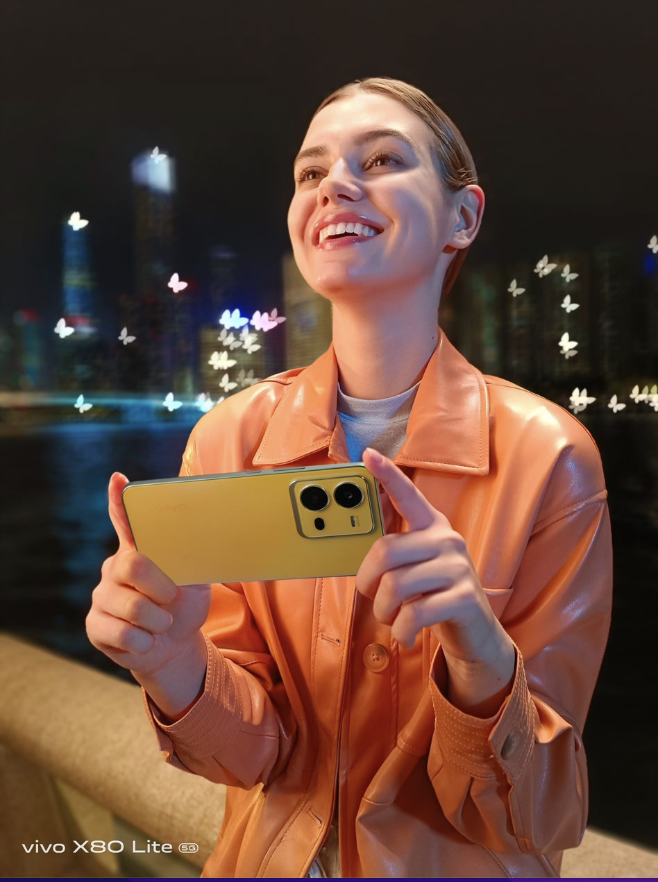
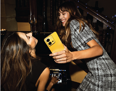
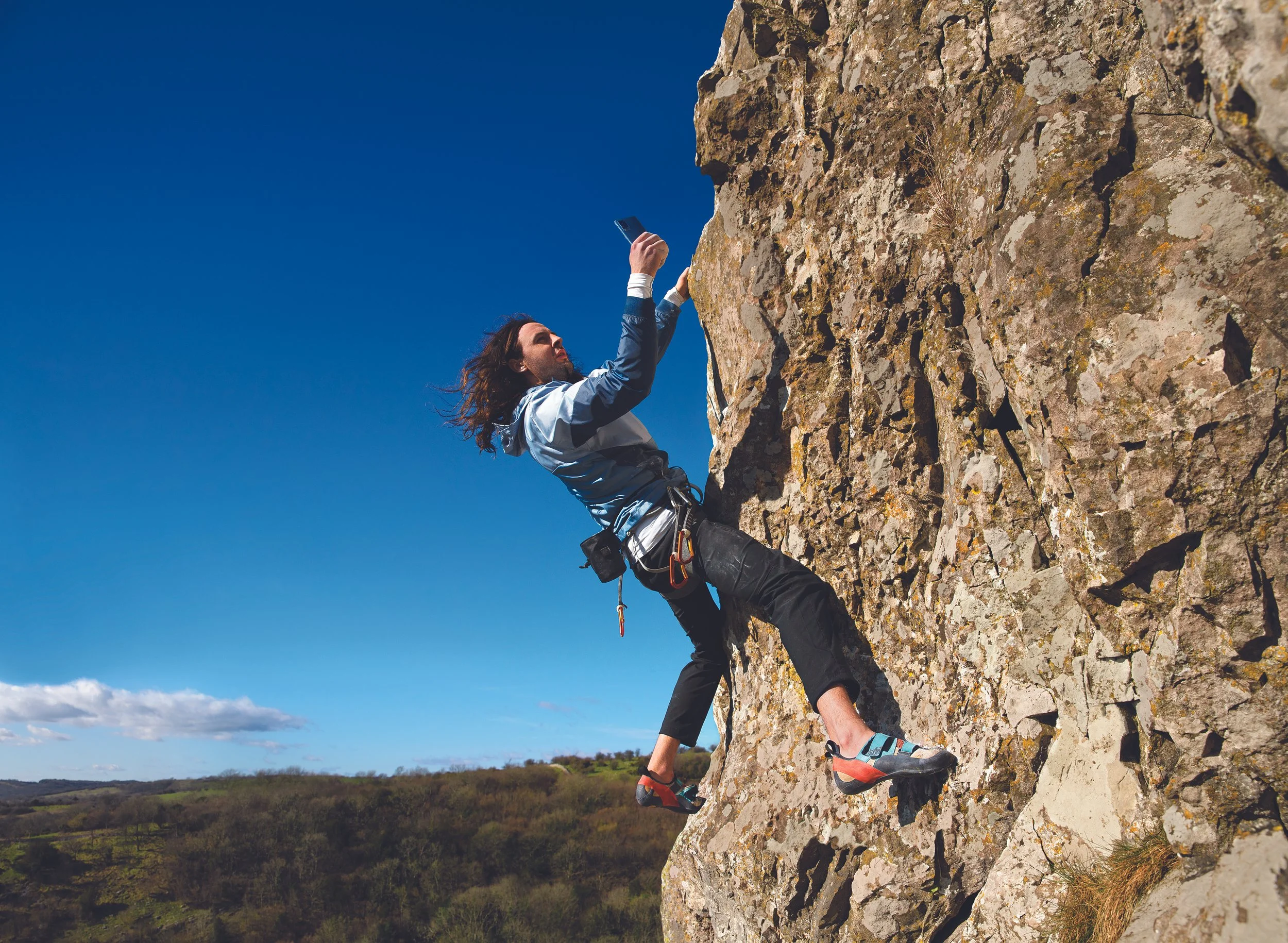
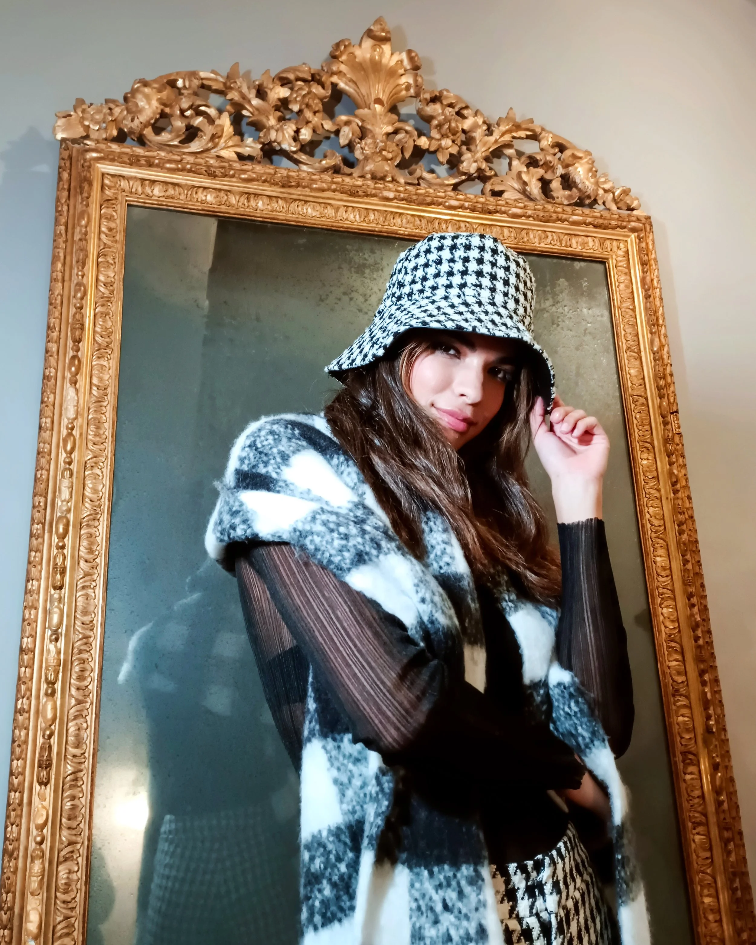
The period between 2019 to 2023 we within the vivo marketing dept created numerous lifestyle, product films and photography covering the entire X, V and Y product portfolio specifically for the European market.
As one of the ‘Senior Content Creators’ the mandate was to create a real sense of joy, which captured and portrayed memorable moments with our products and taking the customer on a journey which captured the spirit of the brand on location and studio and comprehend the power of creativity in their hands.
Content Creative Localisation
X Series Product Launches
Client
vivo Tech GmbH
Region
Pan European
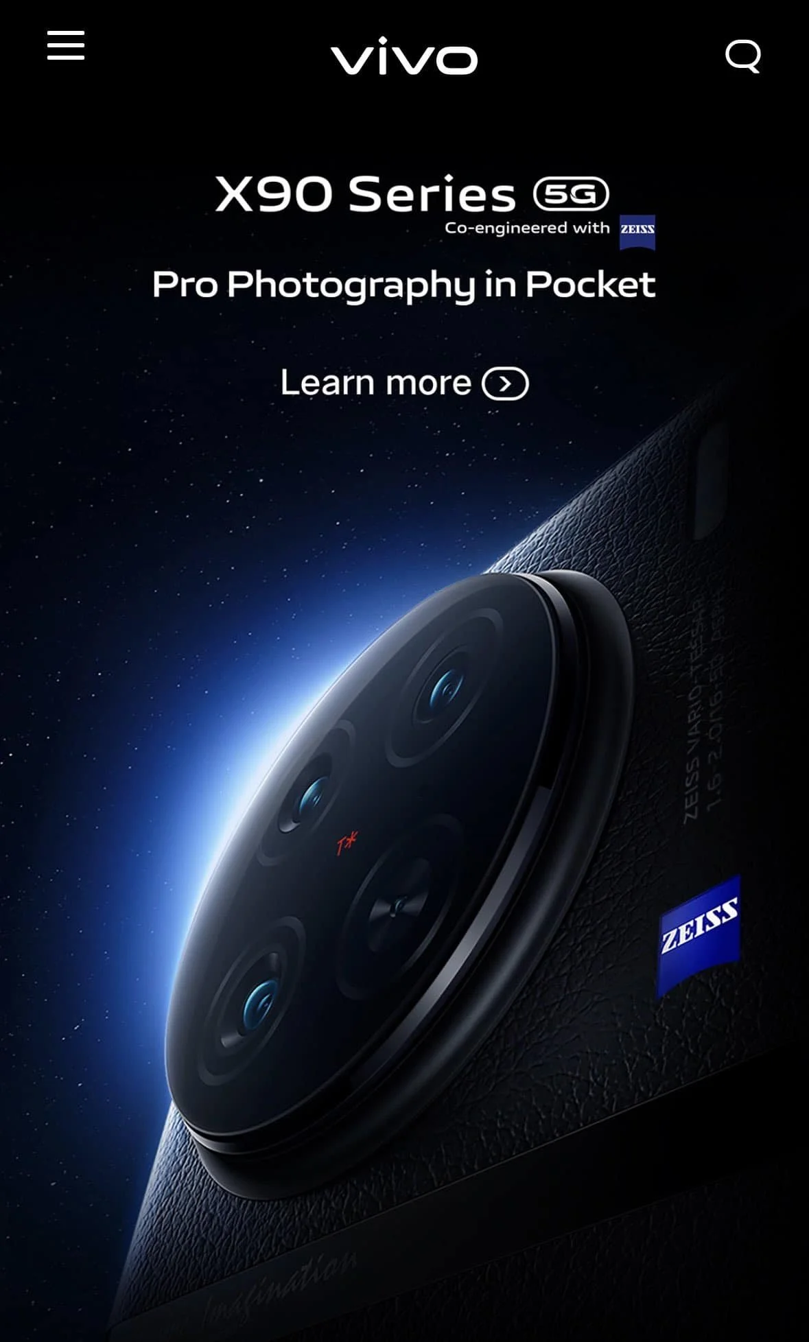
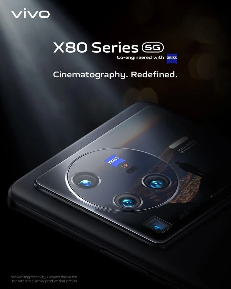
X Series visual tonality is all about Professional & Innovative.
Solidify ‘Camera first’ with ZEISS
at various retail touchpoints.
• Increase visibility on ‘Camera First’
with ZEISS
• Sharpen storytelling of Consumer
benefits
• Delivering a Professional Performance
X Series: Premium photography
Showcase the product with premium elements and focus on ZEISS collaboration. Bringing the strategy to life through responsible and effective Retail collateral material and POSM.
Content Creation Localisation
V Series Product Launches
Client
vivo tech GmbH
Region
Europe
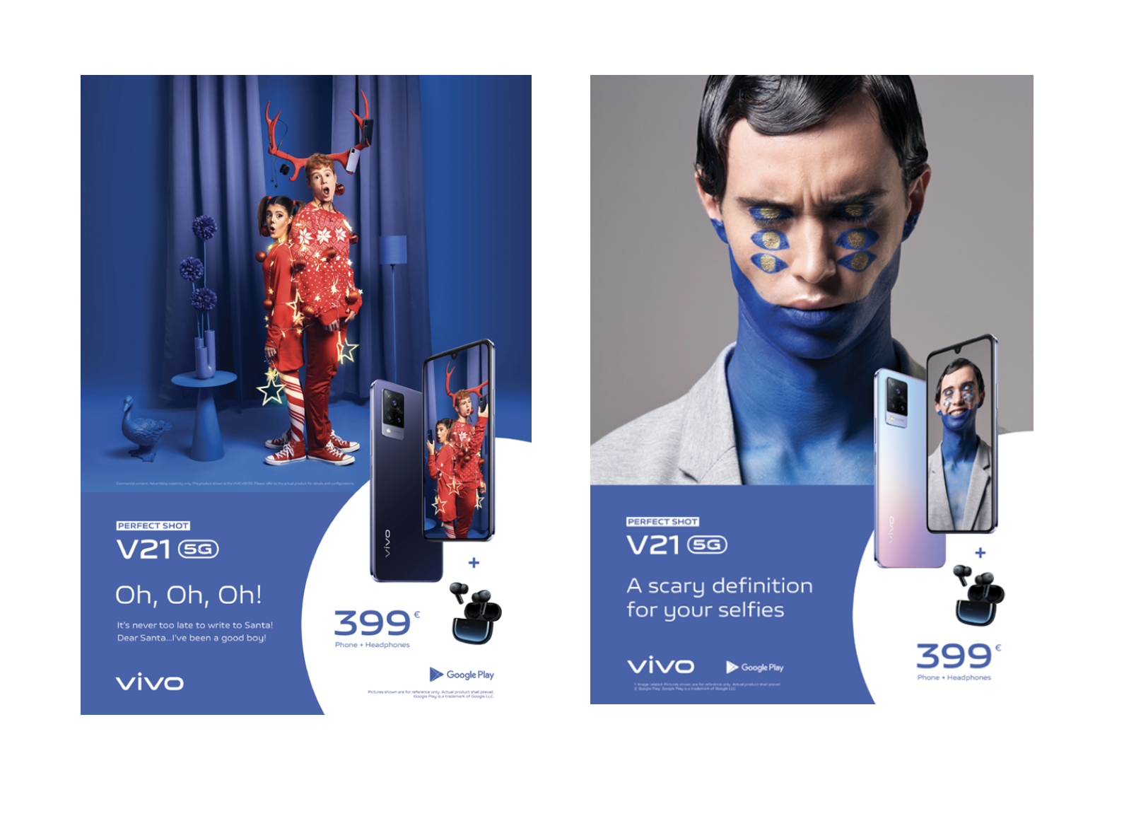
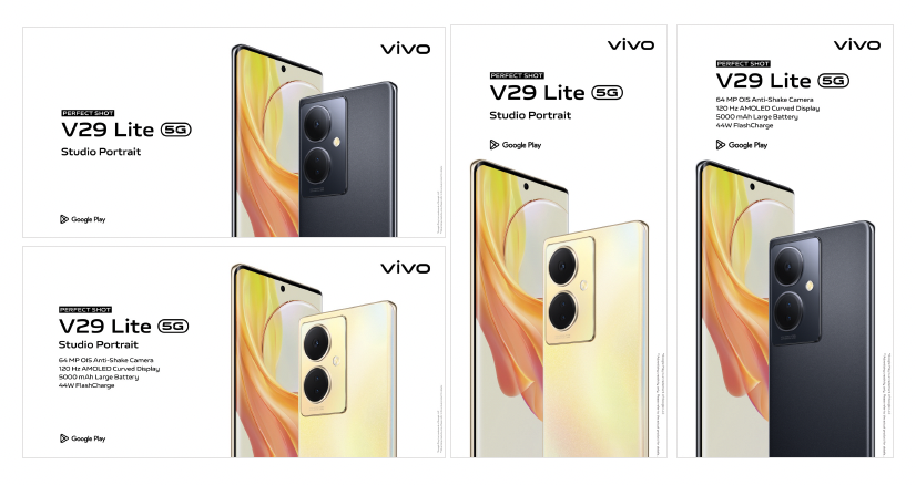
V Series visual tonality is Lively & Stylish. Bringing the strategy to life through responsible and effective Retail collateral material and POSM.
Content Creation Localisation
Y Series Product Launches
Client
vivo tech GmbH
Region
Europe
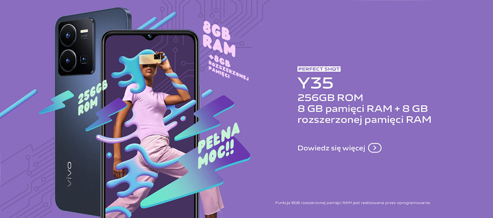
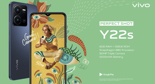
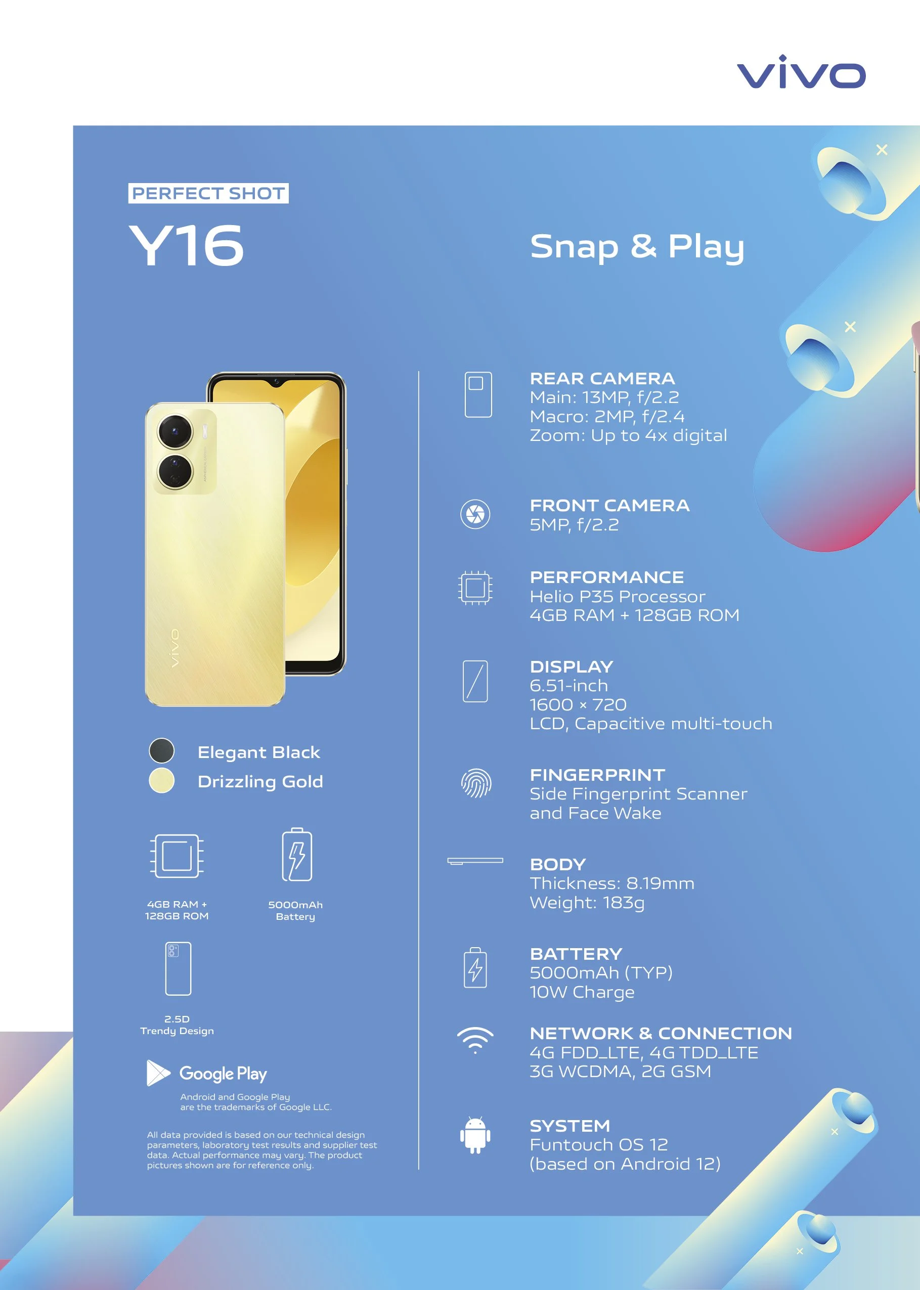
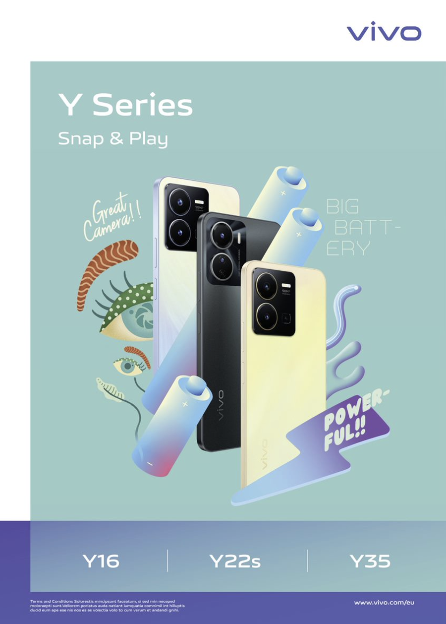
Y Series visual tonality is Young & Dynamic. Bringing the strategy to life through responsible and effective Retail collateral material and POSM. Communicating Excitement and youth by showcase the phone in fresh and quick creative actions.
New Interface Experience
New Launch
Client
vivo Tech GmbH
Region
Pan European
Project
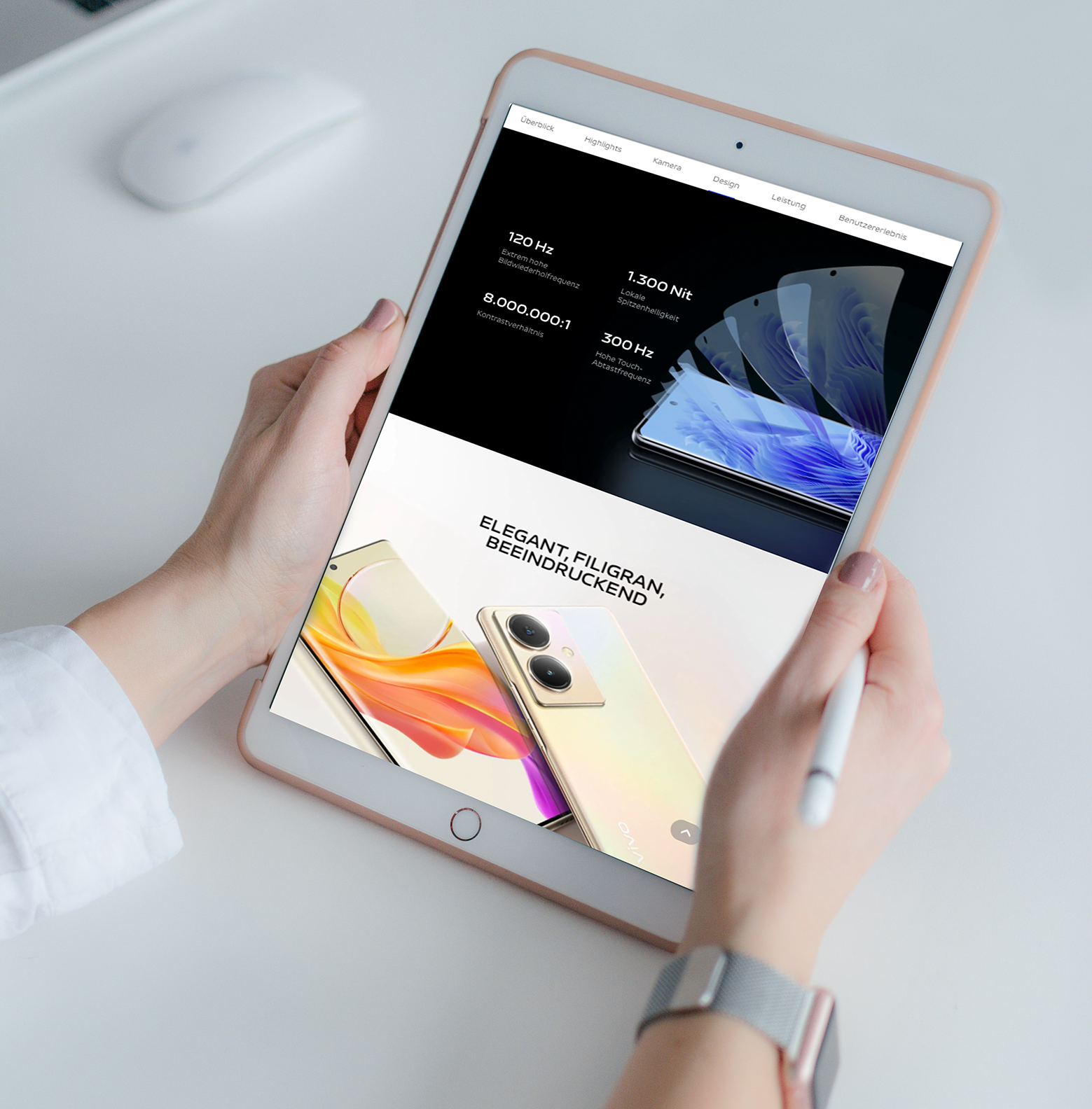
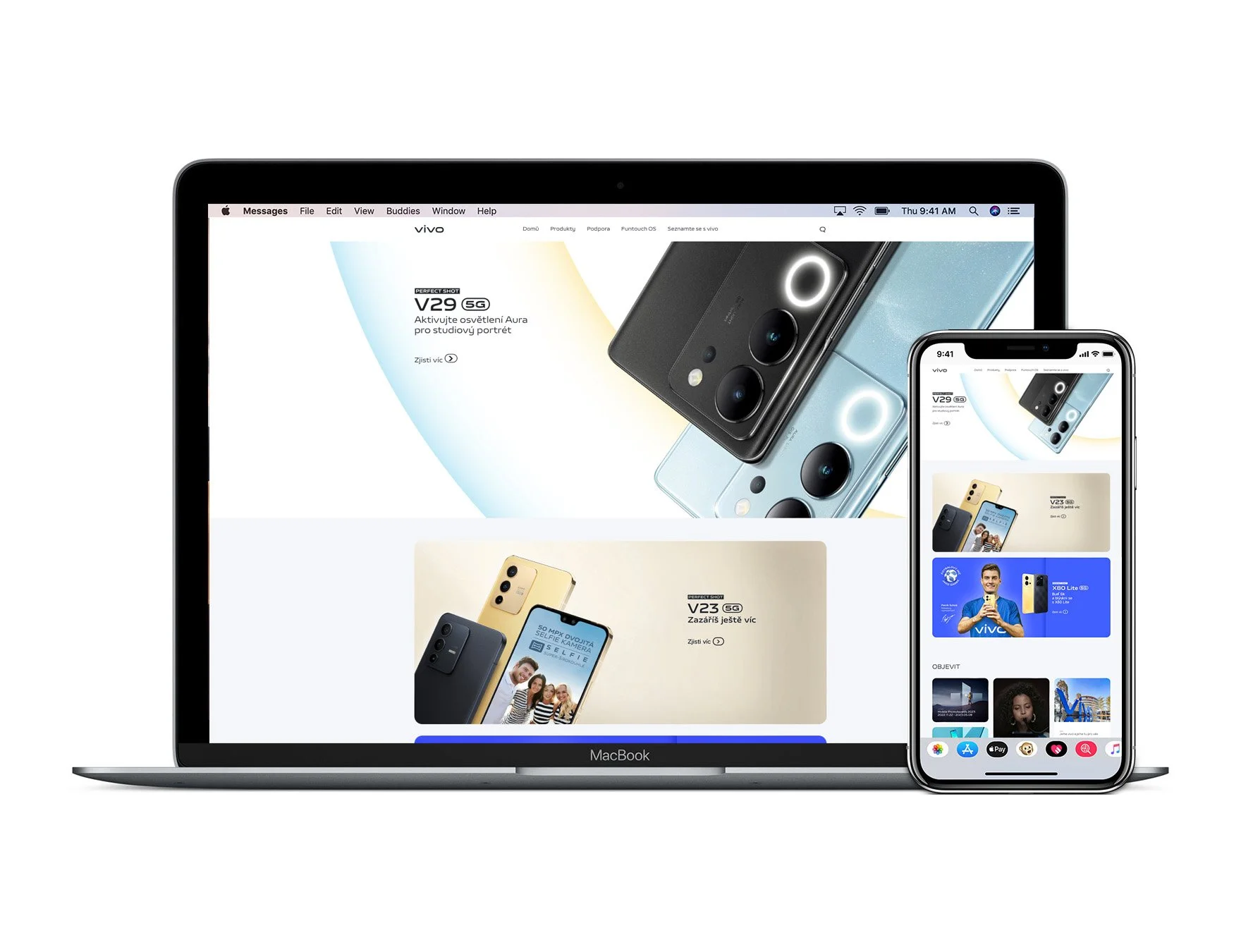
Launched our first 6 key local markets on the 20.10.20. Hence from this date onwards we worked on the next interface generation design, which over the coming years was introduced to 10 new local markets across Europe.
Head lead for Europe whilst collaborating with CHQ vivo web teams and webdesign agency in China.
Strategy
Inter-department collaboration
Oversee Online Strategy
Interface Design
Animated content
Editing Copy
Check product information
SEO Pitch
Data Caption
Image Quality control
Liaising with Local Markets
GDPR Compliance
Cookies
Legal
Customer Experience
Furniture & Prop Design
Client
vivo Tech GmbH
Region
Pan European
Retail offline covered 15 Markets. Quarterly strategic revisions for both CHQ, EHQ and Local markets. This involved investment, furniture development, prop design and
orders etc.
Markets informed EHQ their needs and concerns. We would support through manpower or by distributing funds to solve key Retail requirements.
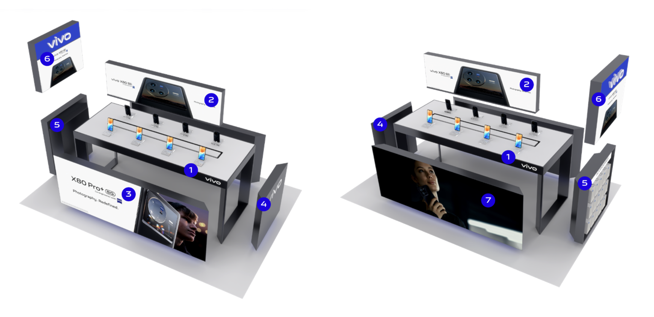
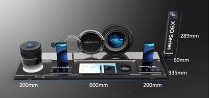
Retaii Furniture 3.0+/3.0++ 2020-23
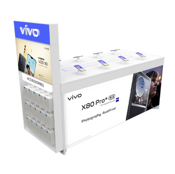
Furniture Design 3.0+
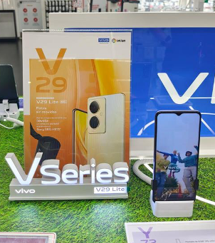
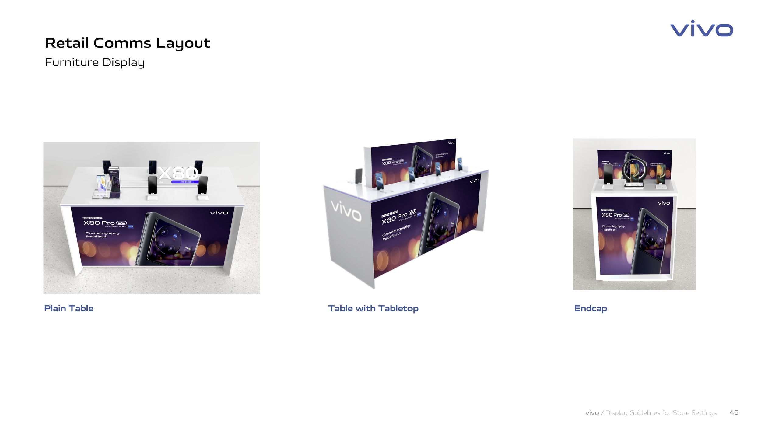
Simple and clean white KV table design remains vivo logo header), bring differentiated visibility.
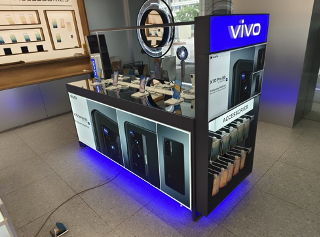
Furniture Design 3.0++
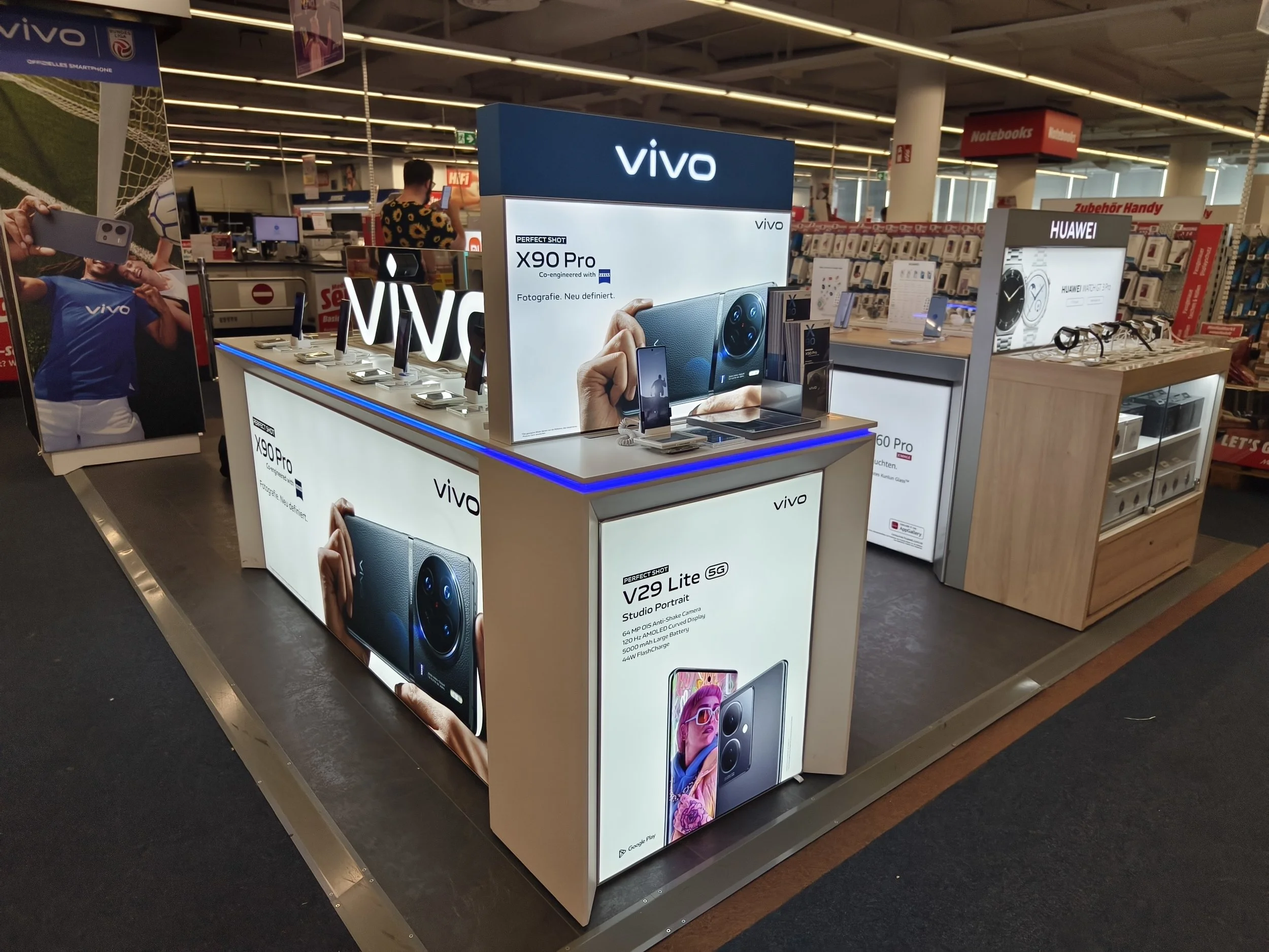
Introducing a cost effective modular furniture with the introduction of LED panel and light boxs. Three markets (Spain, Austria, Romania) introduced the LED panels with instant product sales success and a strong brand in-store presence.
Product & Props 2020-23
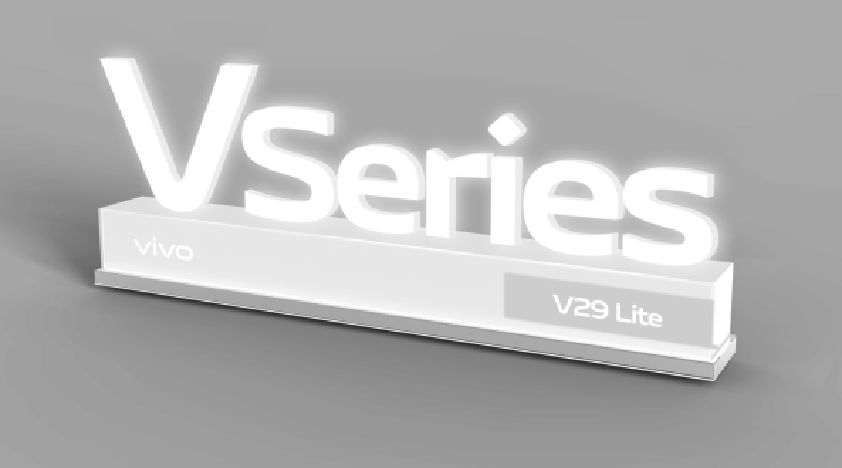
We focused purely on X and V series for consumer engagement and passive props for communicating key USP’s. We engaged in design and materials based on Local requirements whilst closely working with multiple CHQ Retail design teams in China HQ to be aligned with the overall Global direction.
Retail POSM
New Pan European System
Client
vivo Tech GmbH
Region
Pan European
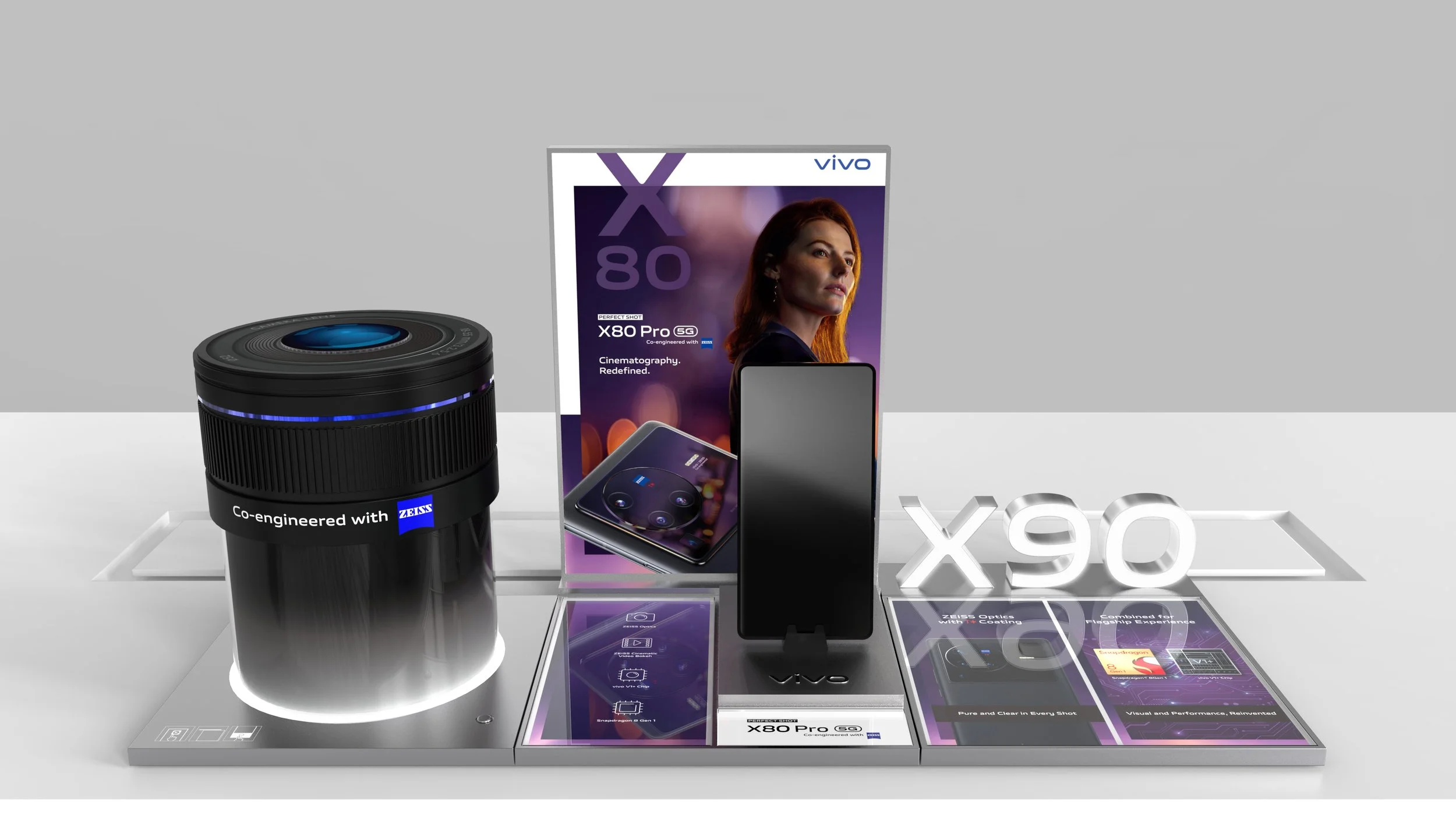
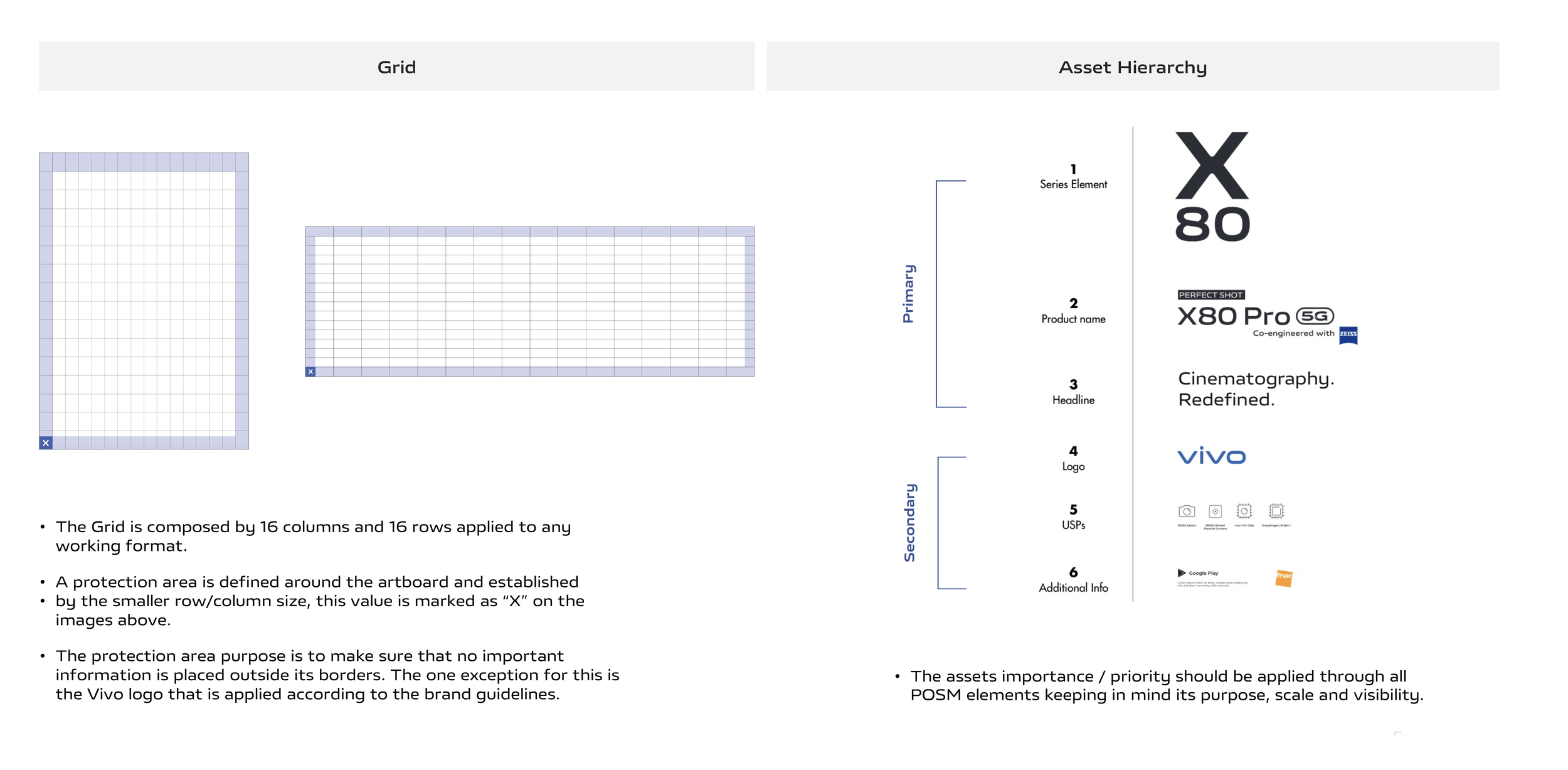
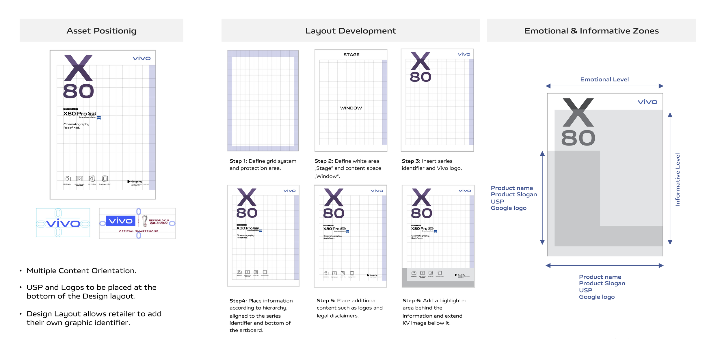
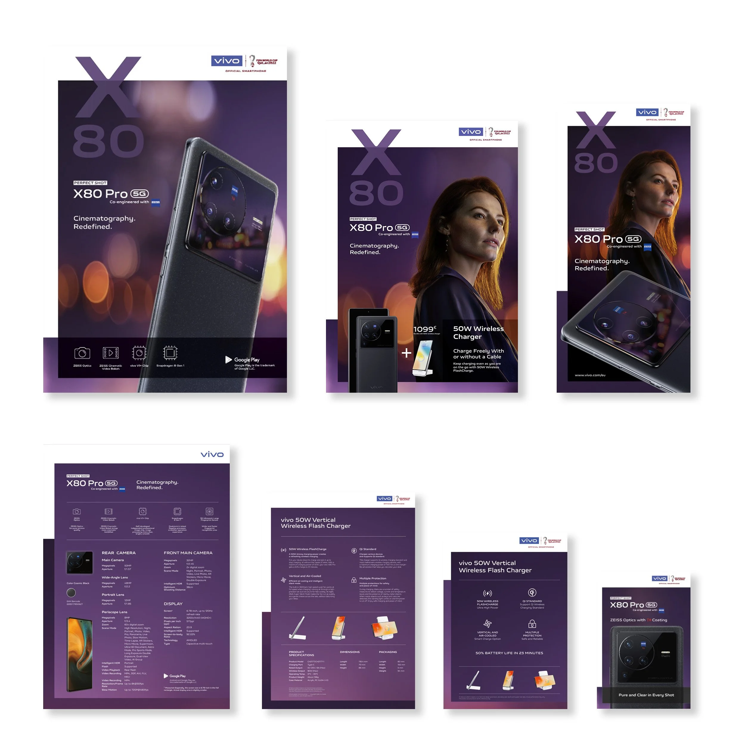
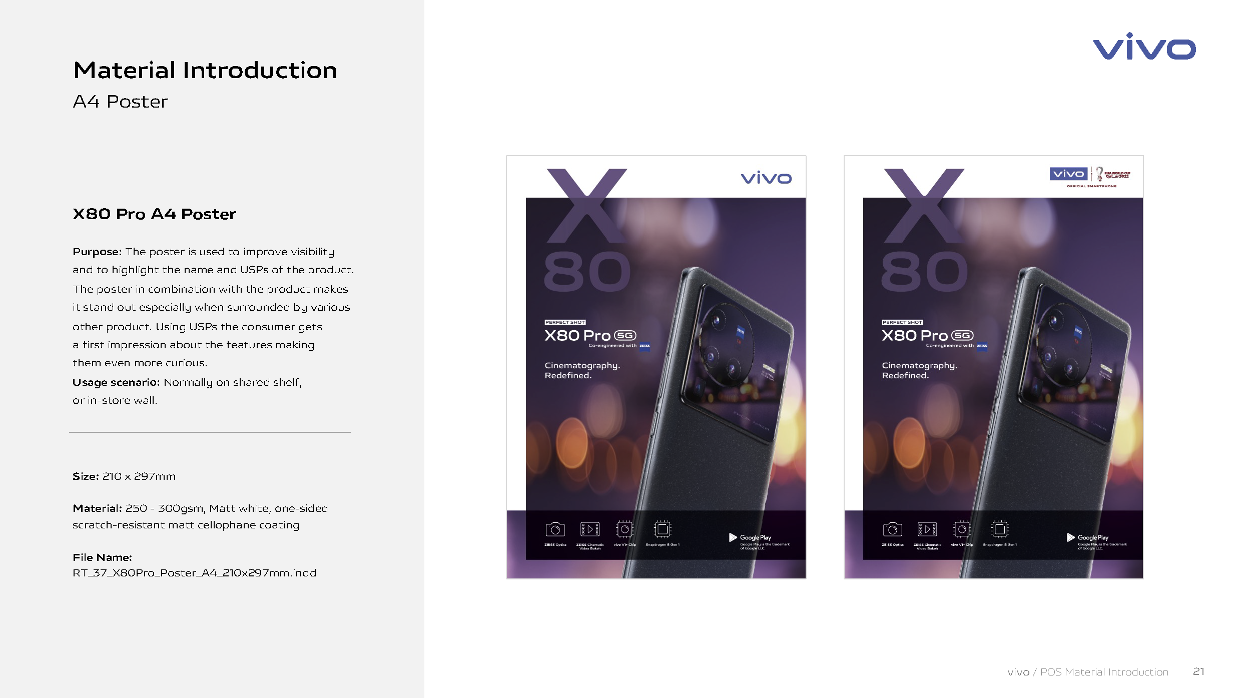
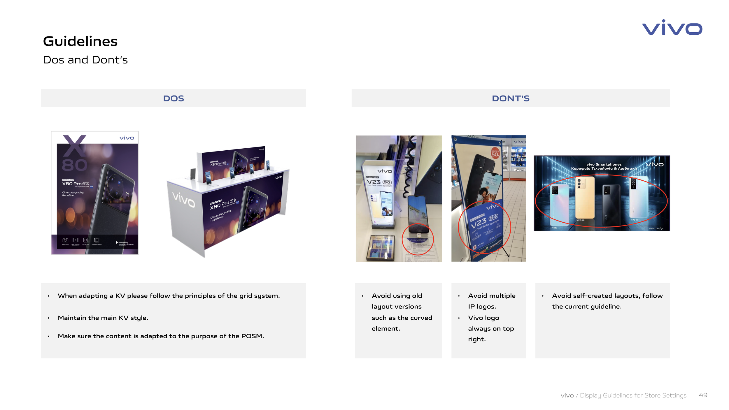
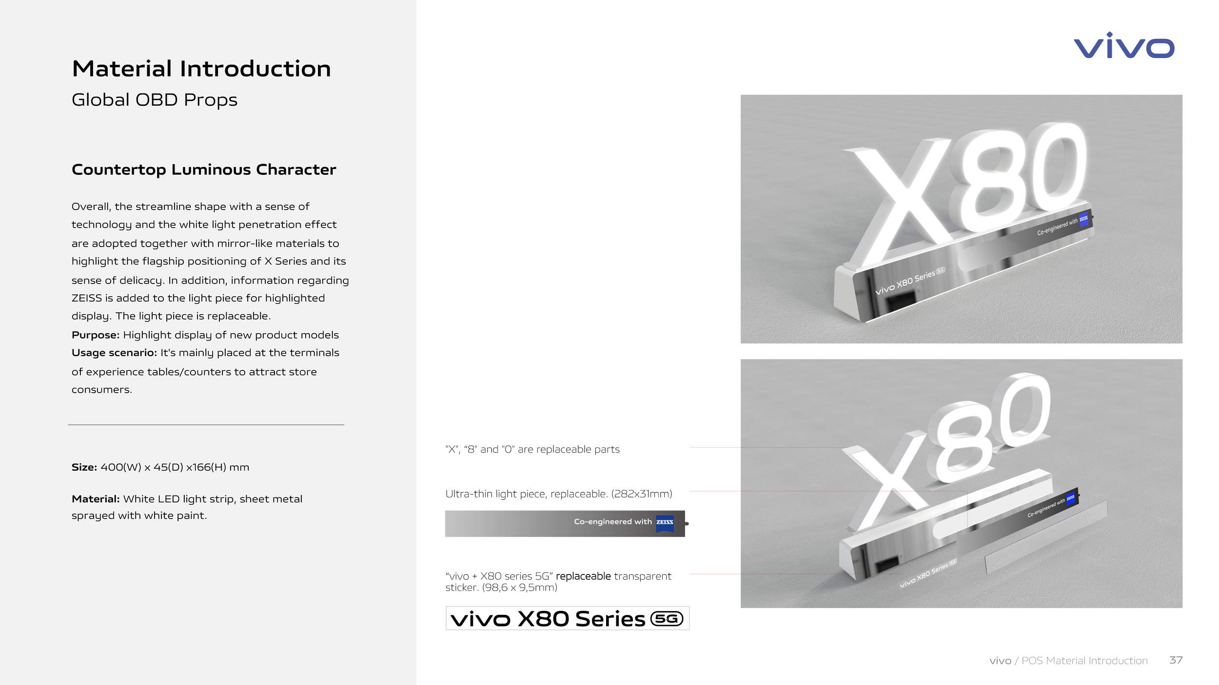
Introducing a New Retail Communication system for each product launch supplying between 20 to 35 POSM assets to each local market in English so each market can adapt to their own language. Also a clear and simple Product Tool kit was designed on the same principles as our POSM design for brand consistency. The target audience was Retailers, Merchandisers and Retail teams from each market to ensure brand recognition and consistency across Europe.
Retail Core Assets
Product Launch Tool Kit
In 2022 we launched the New Product launch kit for all three series (X, V & Y) to create a consistent brand for the local market (Retail teams, Merchandiser and Store managers).
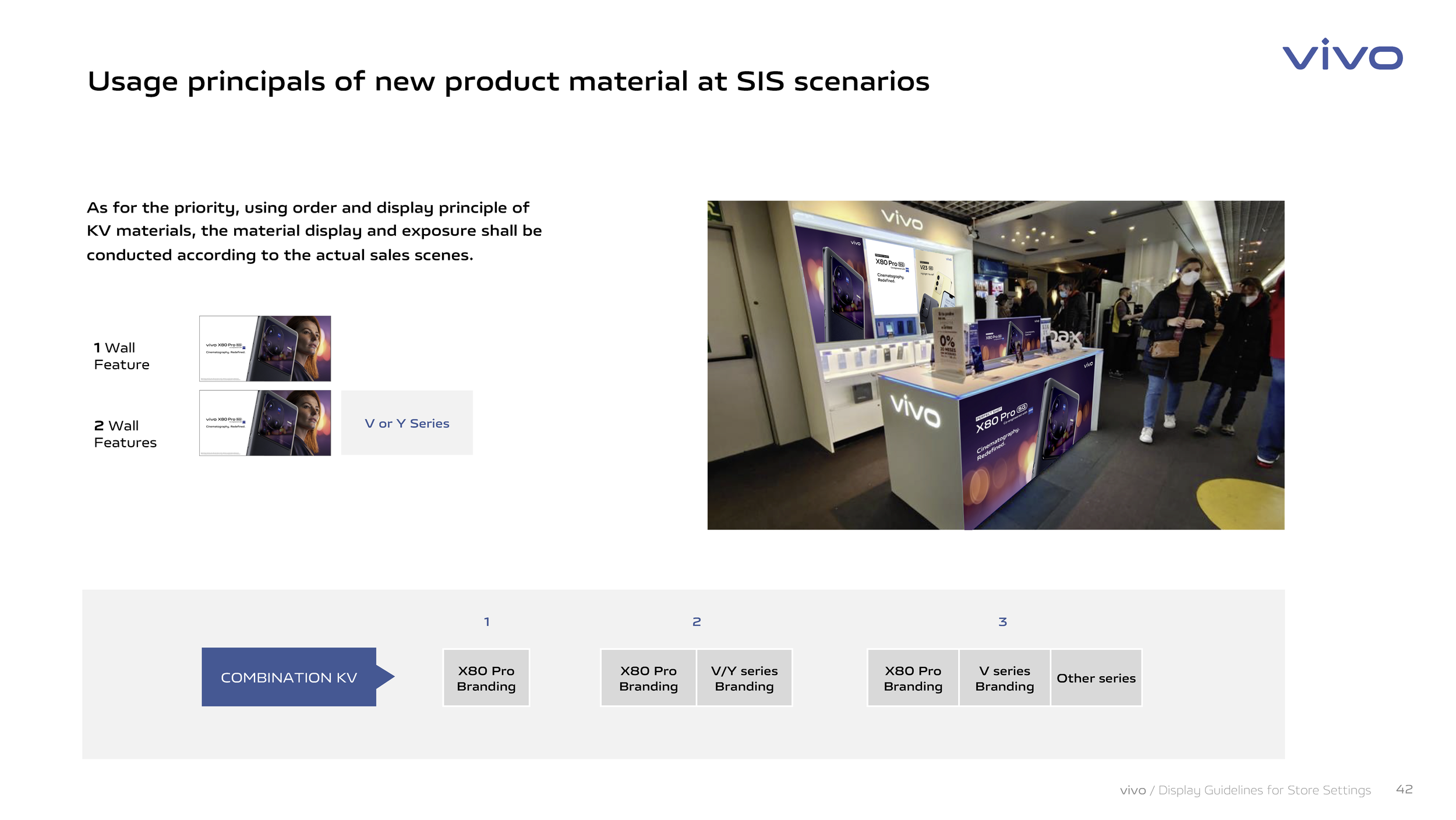
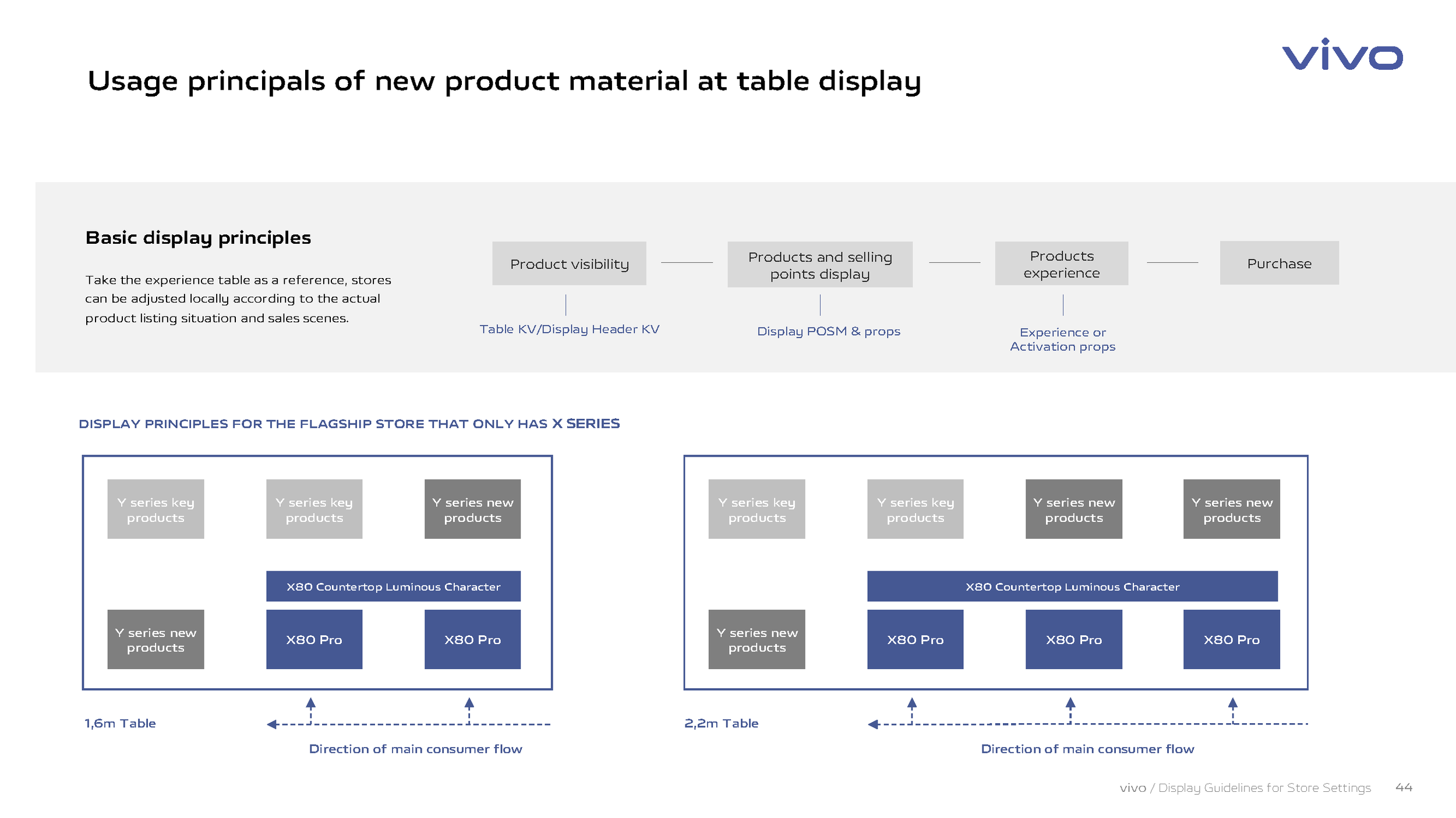
For every X & V series product a Product Toolkit was issued to all markets for installation covering from POSM, Props and POSM Table set up.
Content Creation
Product Launch
Client
NOKIA
Region
APAC - North America
Project
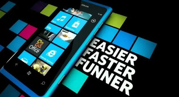
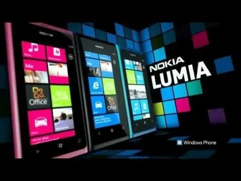
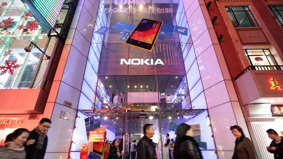
Nokia Lumia 800
In 2011 Nokia launched their first ever Windows smart phone, the Nokia Lumia 800. A ground-breaking launch was conceived to put Nokia one step ahead of the game in terms of technology, brand experience and innovation.
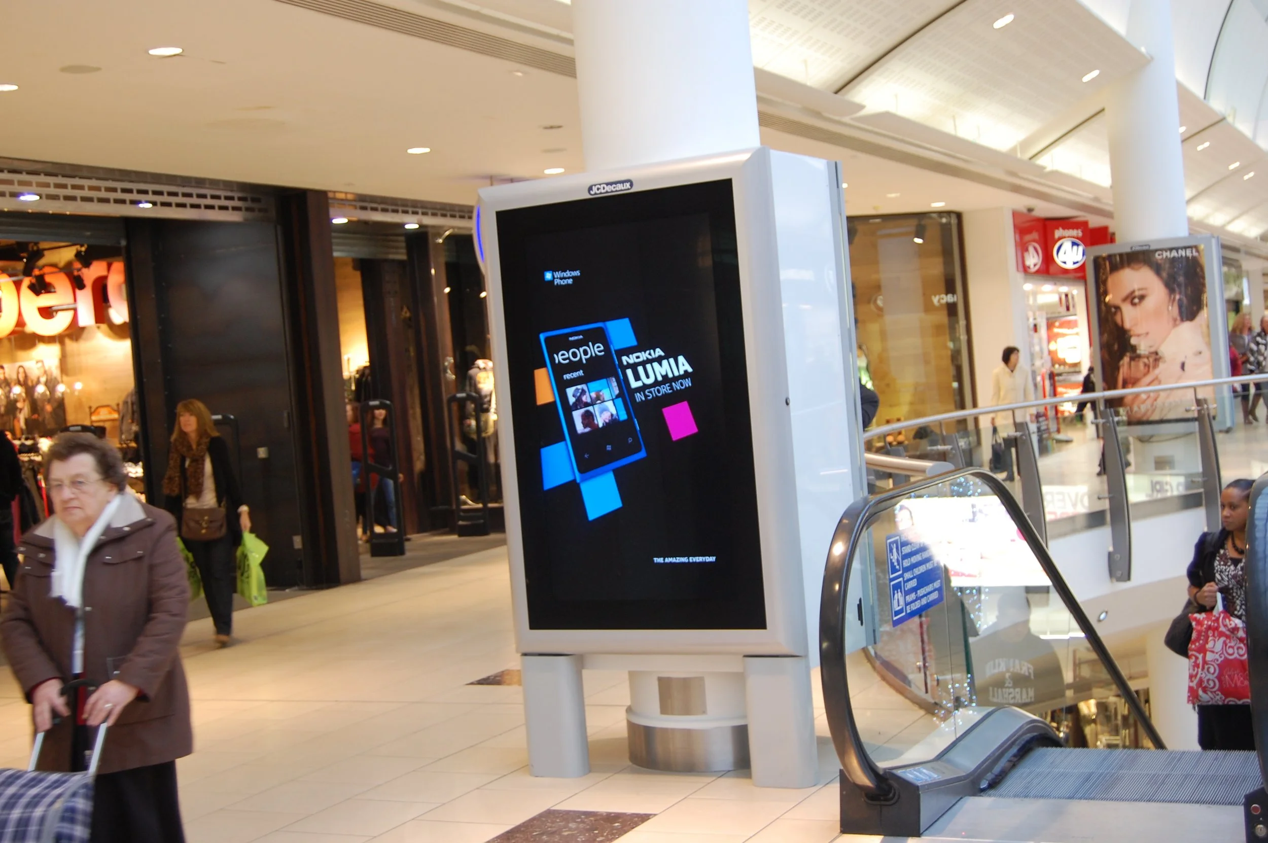
Following on from the previous launch of the Nokia Lumia 800 with its first venture into the Windows Mobile market. The New product look and messaging from the Lumia 800 continues with the Lumia 900 across Retail brand, digital, online, product packaging and corporate communication. Digital Panels advertising Promo, Discounts and Live Events,
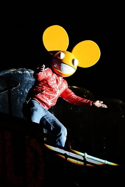
The ground-breaking visual event, to launch the Nokia Lumia 900 in North America, was choreographed to an exclusive Nokia Lumia remix of Nicki Minaj’s hit ‘Starships’, performed live by DJ and producer Doorly in New York.
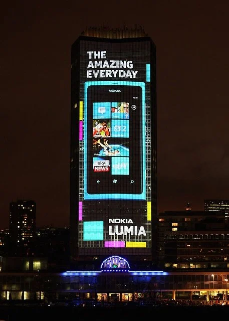
Whilst in London a dynamic projection mapping to the next level with Nokia Lumia and Deadmau5 Millbank Tower display in London ( Music interacting with lights).
Working with ‘Drive Productions’ worked in partnership with ‘Mission’ whilst working at ‘Inferno’London to create an event which would be so astounding that it would go viral within minutes, draw thousands of spectators to London and encourage people worldwide to sign up to Nokia’s Facebook page to view it live.
Content Creation
Online & In-store Communication
Client
Meteor
Region
EIRE > Europe
Project
Meteor, the “disruptive” newcomer, valiantly played a game of catch-up with its original competitors.
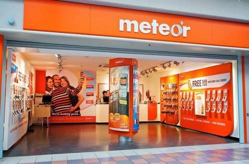
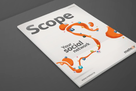
Metoer shops have been designed to appeal to the browsing mobile phone consumer with an open, interactive space displaying handsets ready for trial as part of its ‘Your Social Network’ campaign.
This interactive space includes large screens, multimedia displays and ‘Try Bars’ and includes live demos of Meteor Mobile Internet on a range of handsets in store.
We designed the stores with customers in mind, we know people like to try before they buy and with the new interactive design, customers can check out all Meteor has to offer using the live handsets, while experiencing first hand how easy it is to use Meteor Mobile Internet and social networking on your mobile.
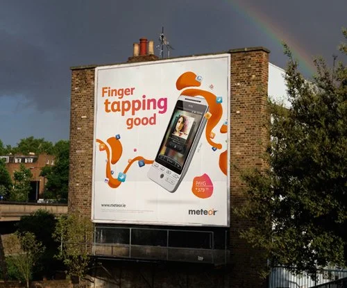
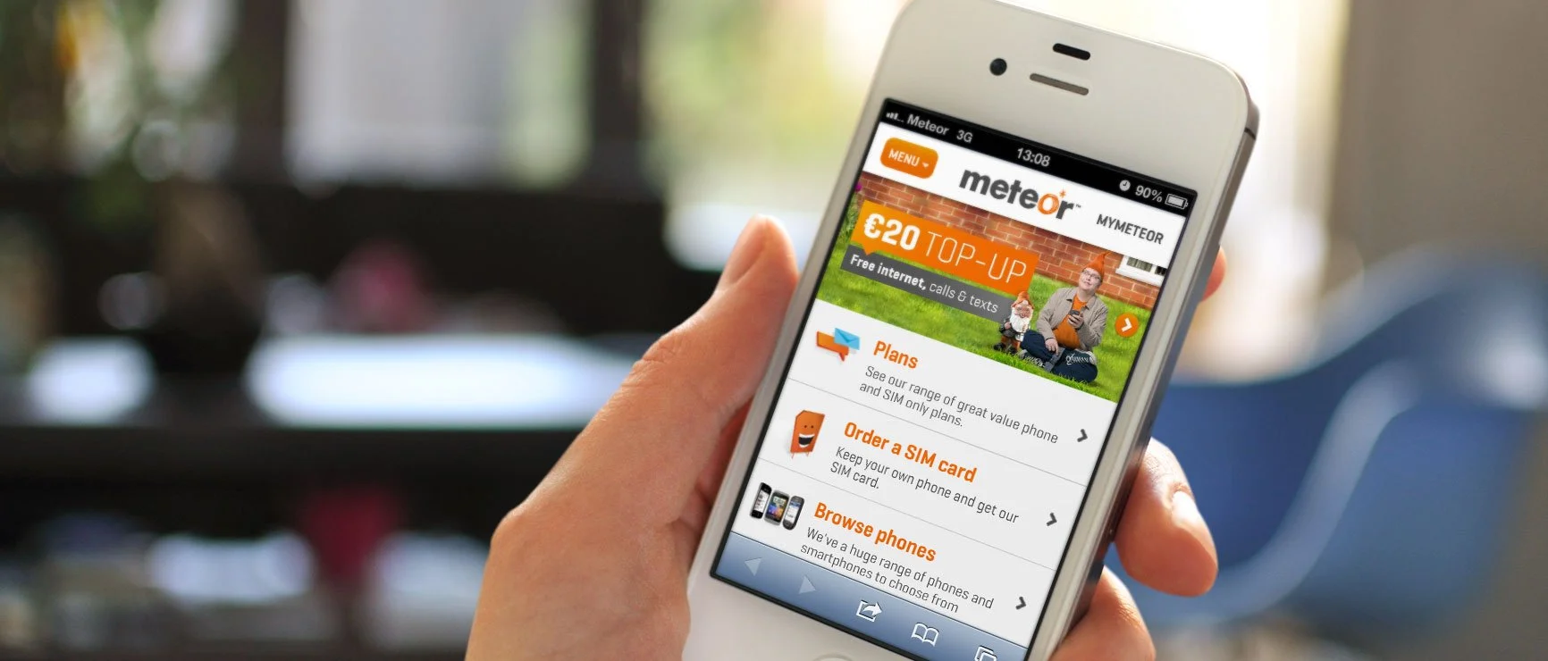
Brand guardians across Retail brand, digital, online, product packaging and corporate communication. Digital Panels advertising Promo, Discounts and window video promos.
Core Sponsor
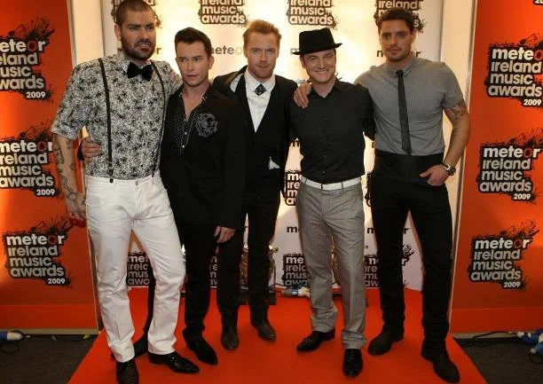
Meteor Award ID
The Meteor Ireland Music Awards are given to artists for their successes in Ireland and internationally. They were awarded annually.
Auto Brands
‘Propelling compelling and engaging storytelling both for Press and Public awareness’
‘Clean mobility
all-new KONA electric
Client
Hyundai
Region
Geneva > Europe
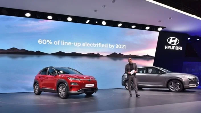
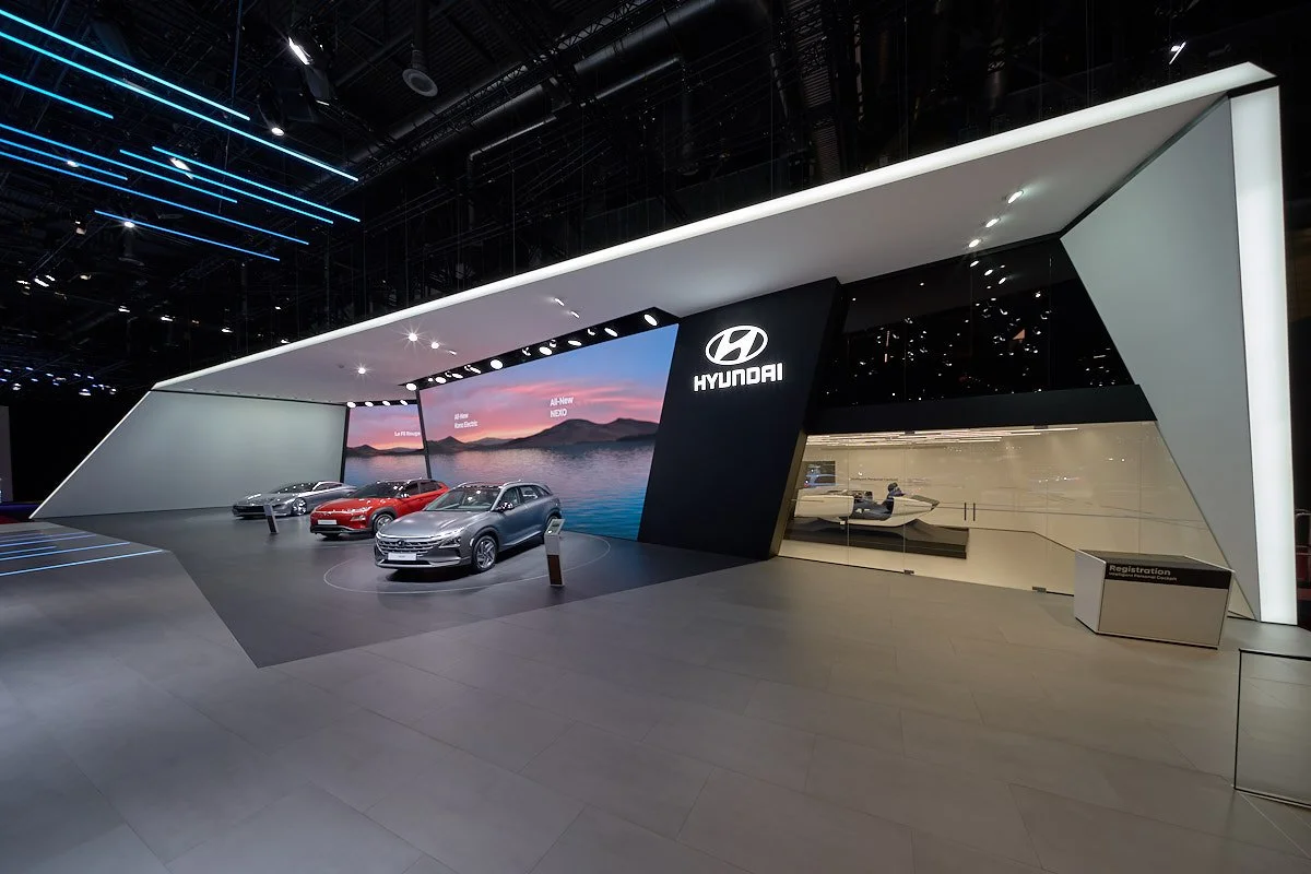
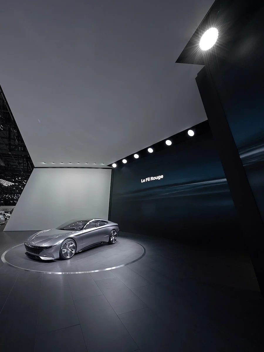
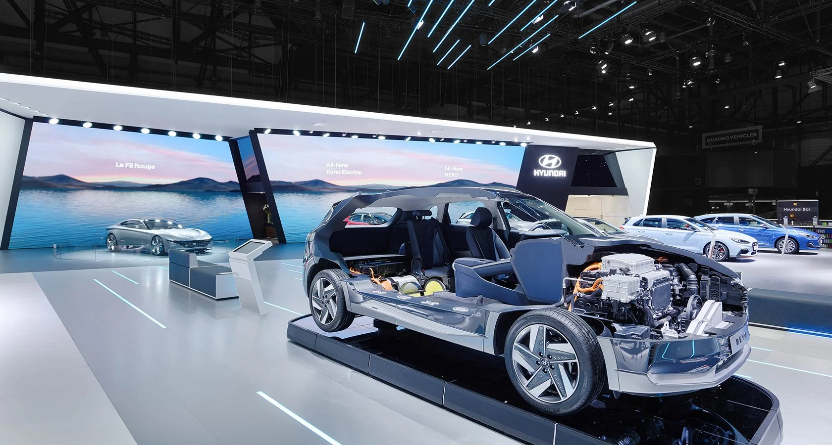
We successfully created and executed the creative development and construction for Hyundai Motors Group booth at the 88th Geneva International Motor Show.
Hyundai Motor theme focused on ‘Clean mobility’ including the introduction of KONA electric, NEXO and the world premiere of the much applauded Le Fil Rouge concept.
‘Clean Mobility’ were at the heart of the overall theme within the Press conference, architecture and communication. It was a first for Hyundai to instill a common thread across all aspects of design and messaging.
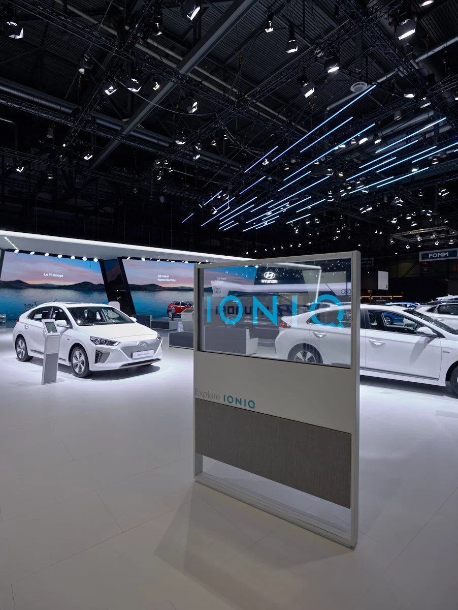
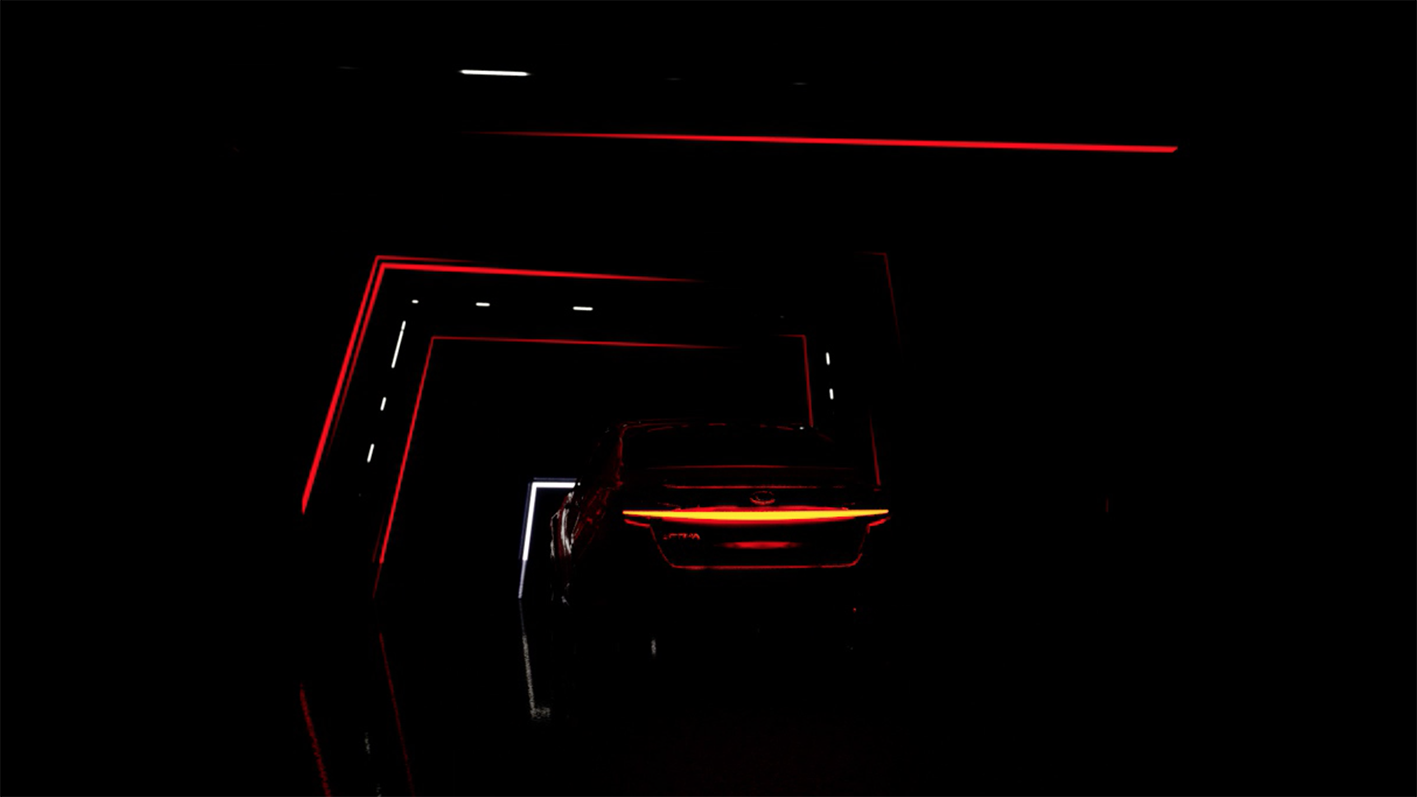
The architectural landmark this year incorporated lighting installations suspended 6-meter high above the booth creating a smart energy flow. These LED stripes embodied the overall theme ‘Clean Mobility’, emphasizing Hyundai’s pioneering role in the industry.
Motor Show Experience
‘New Rio’ & ‘all-new Stinger’
Client
Kia
Region
Geneva > Europe
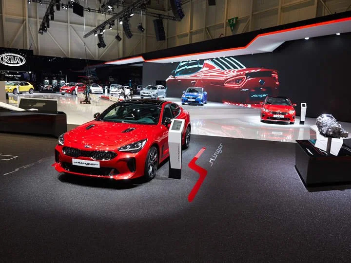
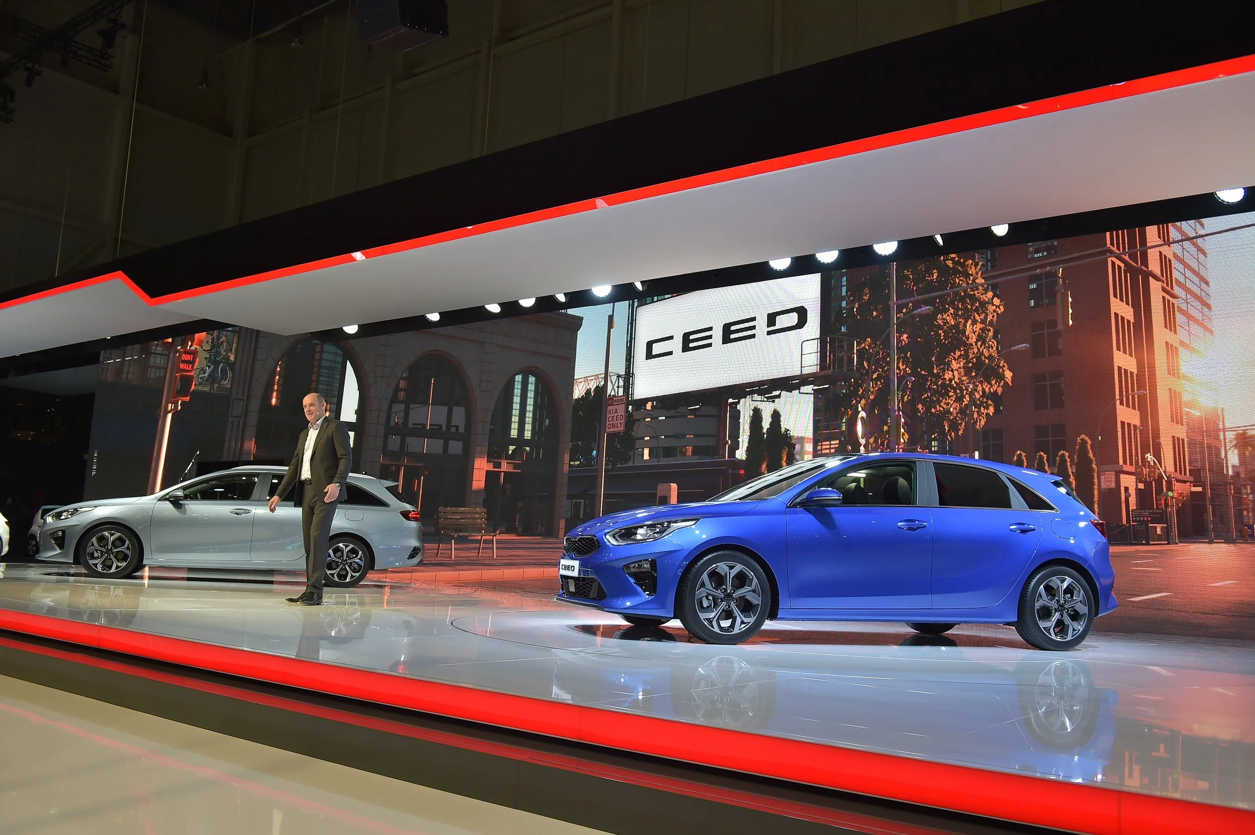
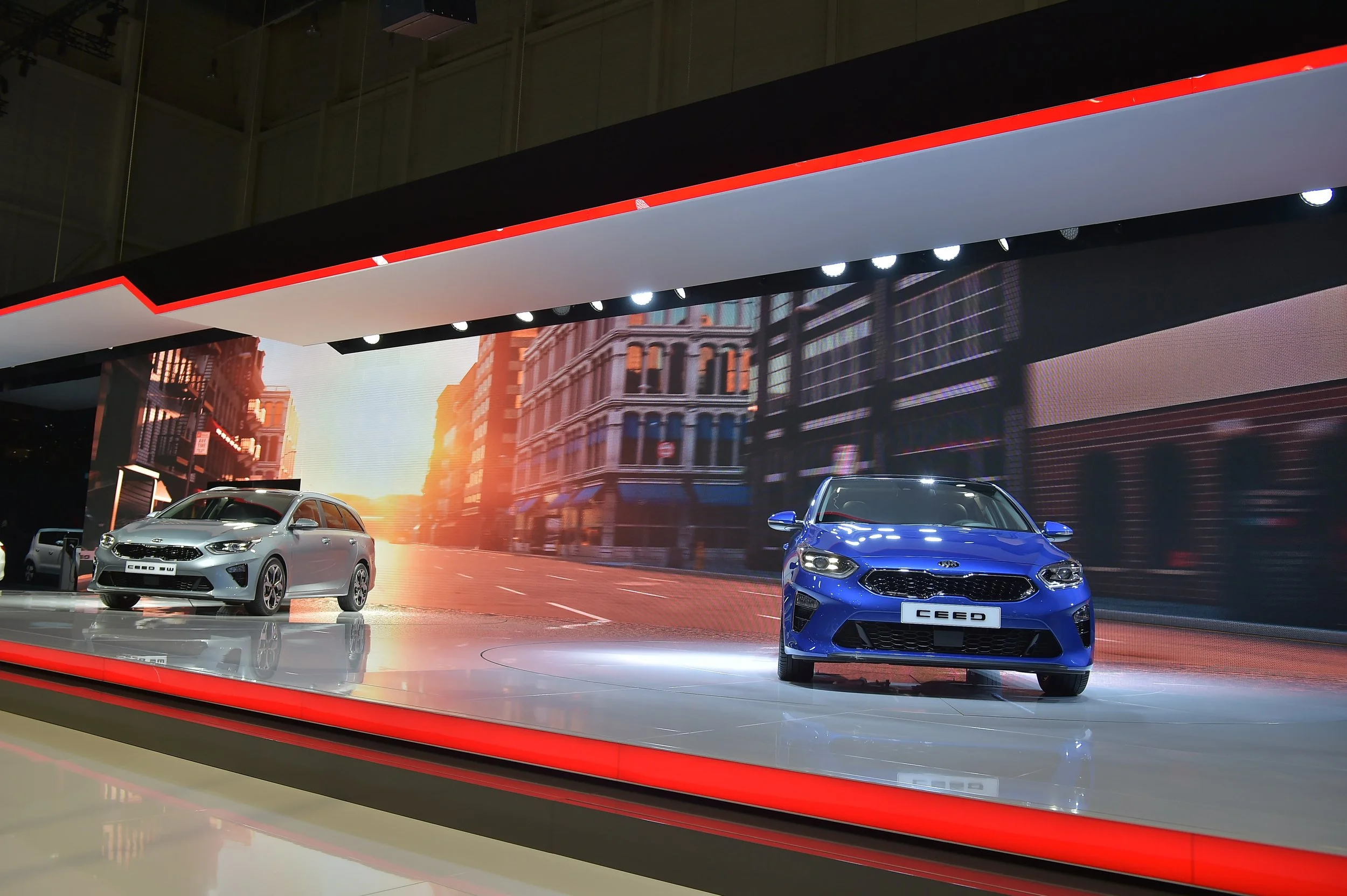
At the 88th Geneva Motor show Kia’s brief was to retain the current the booth design and look at alternative innovative ways, by adding depth with the architecture through communication and create a featured zone for the Stinger
and the New Rio.
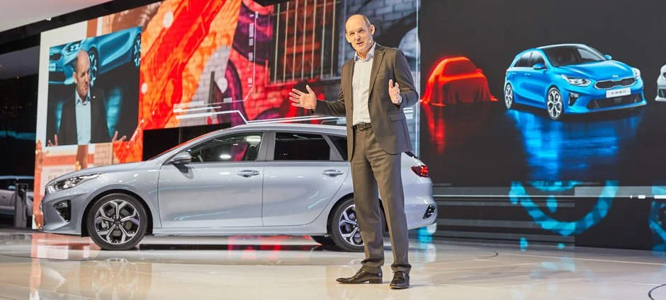
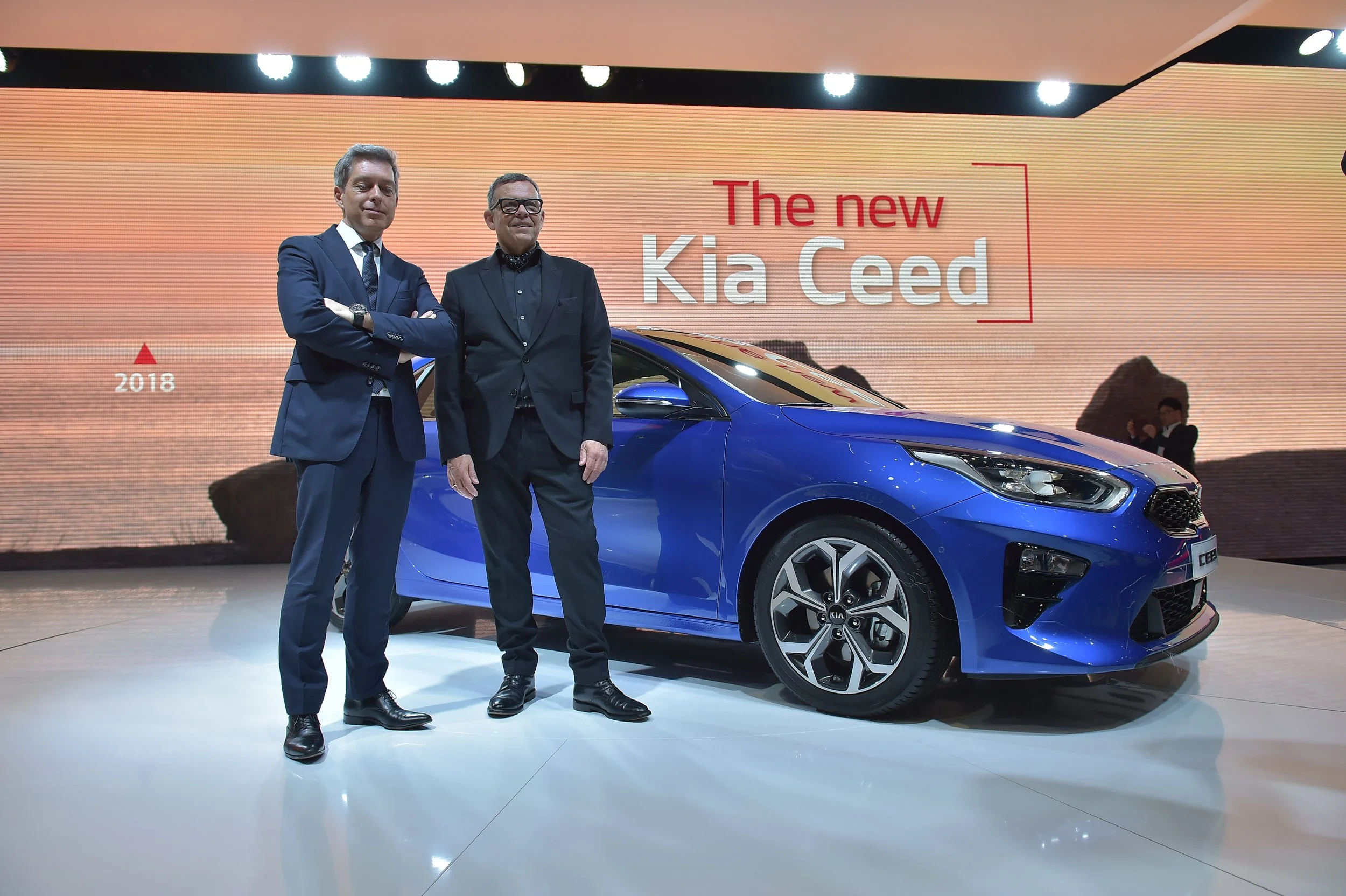
The main focus was the introduction and launch of the 4th Generation Ceed. We created a CGI world of LA to match the product which we filmed in early January. This allowed us the means to create simulated driving scene through the city whist the cars moved on the turntables.
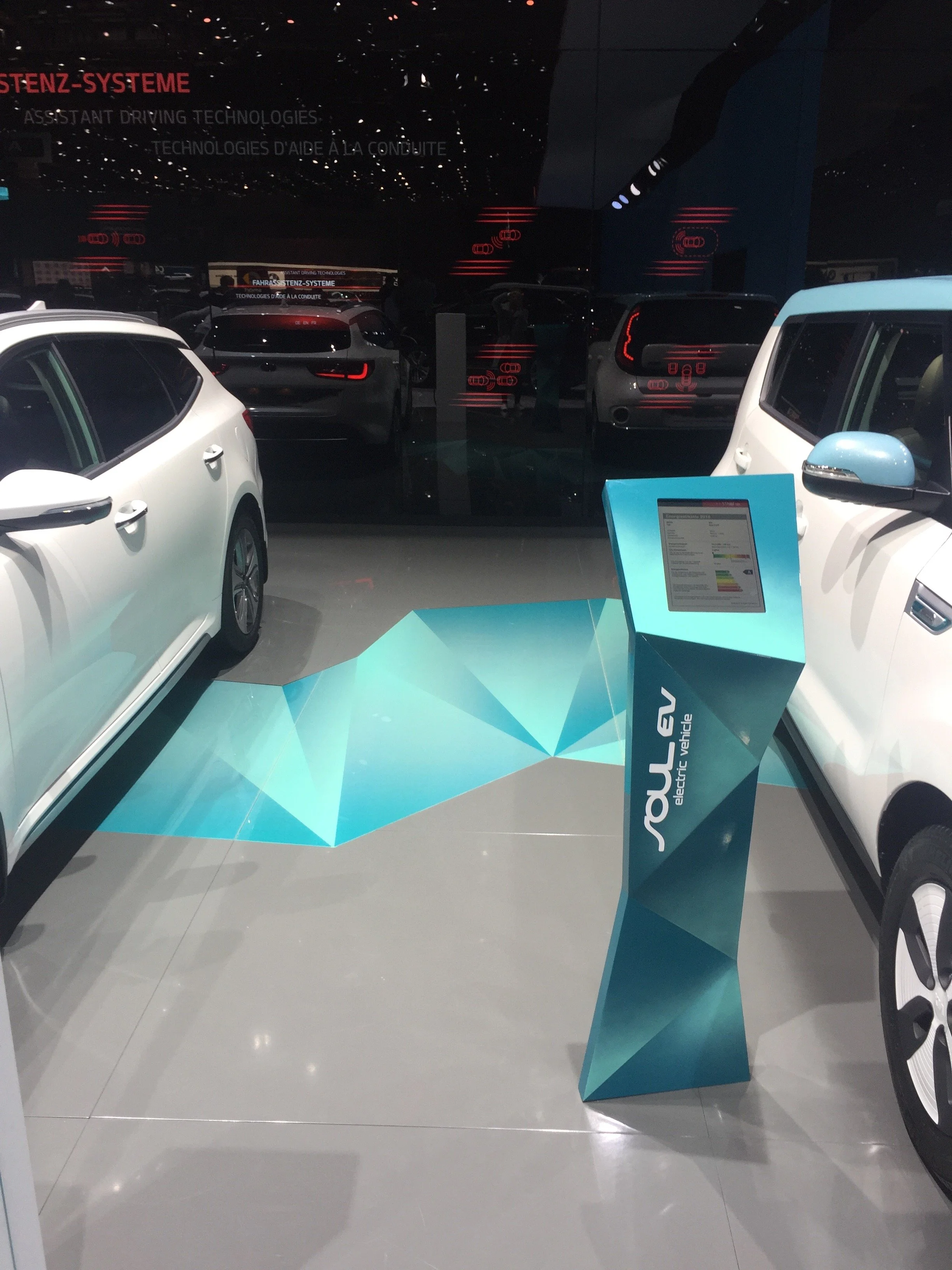
We also created an Interactive wall communicating ‘Assistant Driving Technologies’, through multiple touch screens. Central screen played 8 movies highlighting all the new features across
a number of Kia cars.
All New Line-up
’all- new i30N’ & ‘Kona’
Client
Hyundai
Region
Frankfurt > Europe
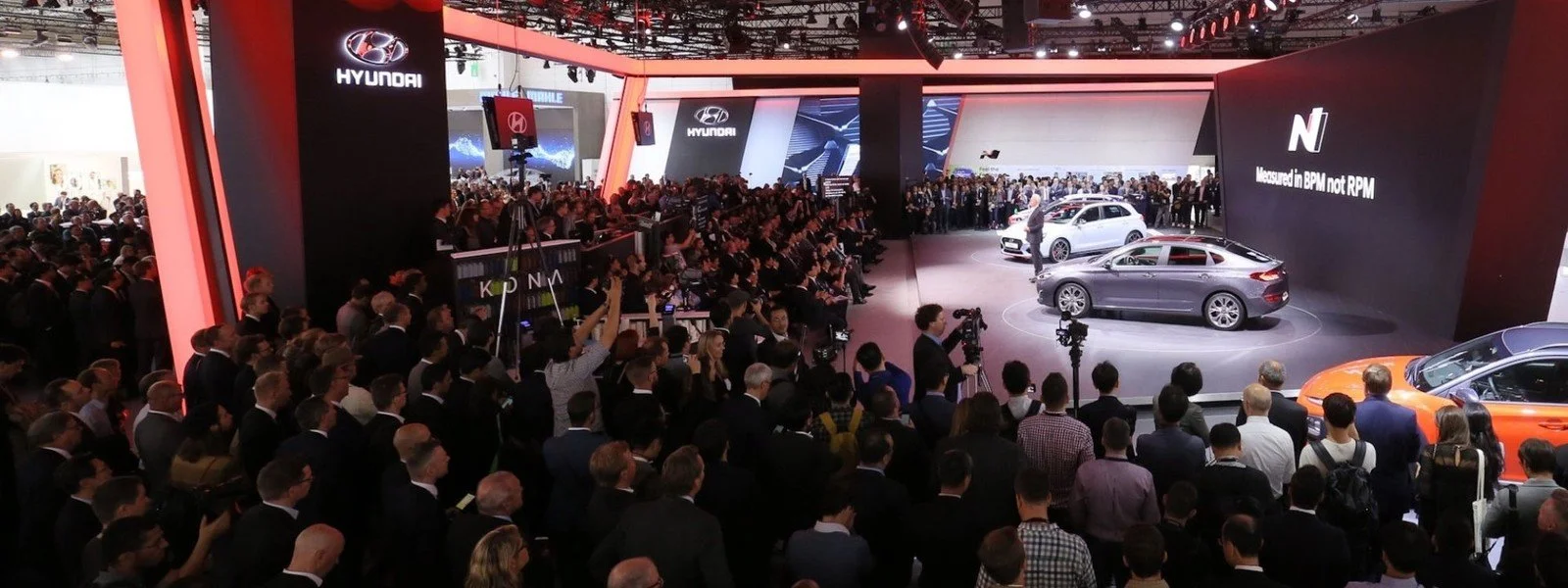
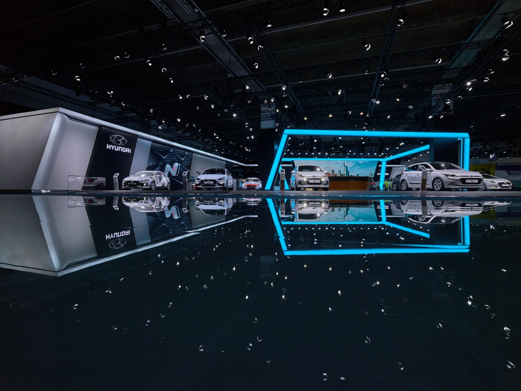
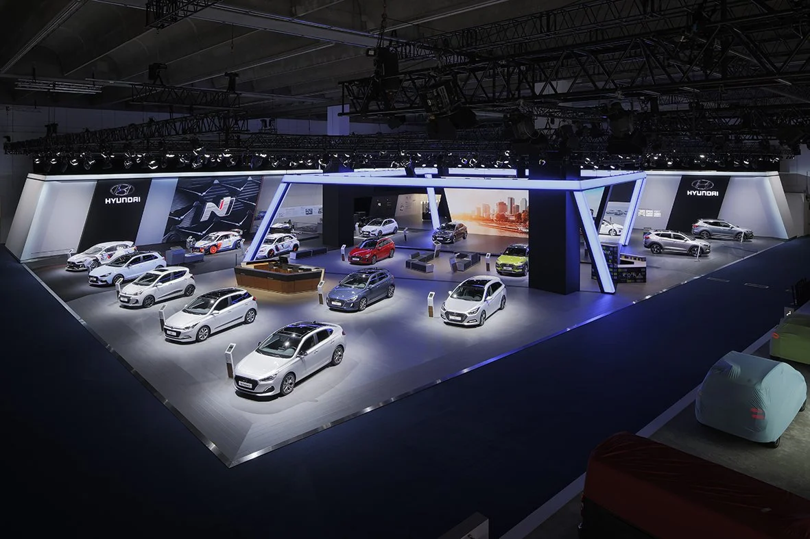
For Hyundai at the 67th Frankfurt Motor Show, a global event which drew the world press and over 810,000 visitors to Frankfurt during the month of September.
As custodians of the brand our challenge was to define the strategic relevance for each brand at the show bringing to life key products and brand messaging.
Three cars launched to a global audience - the i30 fastback, the all-new KONA and i30 N, showcasing Hyundai’s C-segment range, lifestyle and its motorsport spirit.
Our Hyundai booth introduced a new architectural landmark feature named
the ‘Crystal’, which was positioned within the heart of the booth integrating a freestanding LED wall and the highlight stage. Programmed to animate over one million colors, this geometric color-changing LED structure perfectly framed the hero cars KONA, i30 Fastback and
i30 N during the Press Conference and visitor days.
The booth also included a new water bar where 40,000 free KONA designed water bottles were offered to visitors. Queues stemmed between upto 40 to 50 meters.
Press Conference
Opening Film
Created a timeline of human interests overlapping throughout the day. The ‘all-new Kona and its owner actor take you on a
20 hour journey throught his life through his city.
Press Conference & Public Viewing
Hero Film
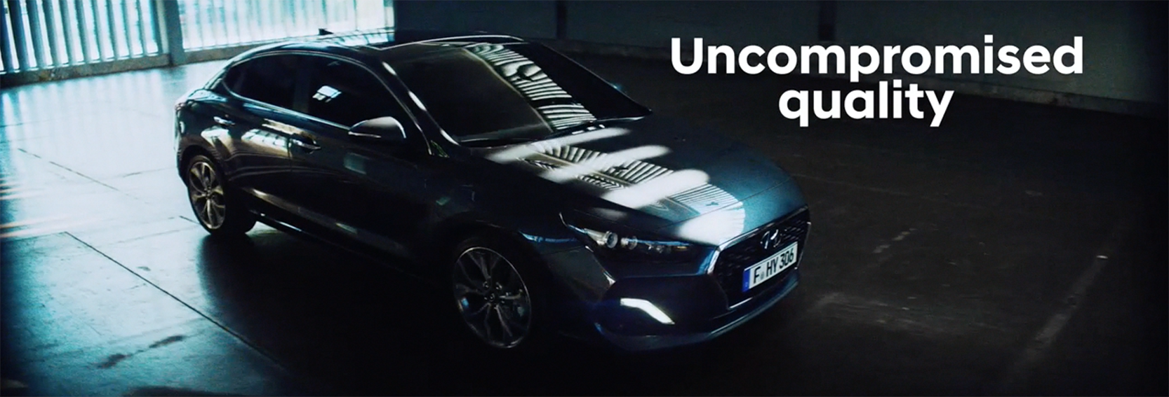
For the Hyundai press conference we celebrated the launch of not just one, but three Hero stories covering Performance,
Sustainablility and Touring for uncompromising quality.
Press Conference
& Public Viewing
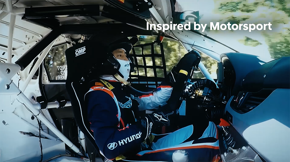
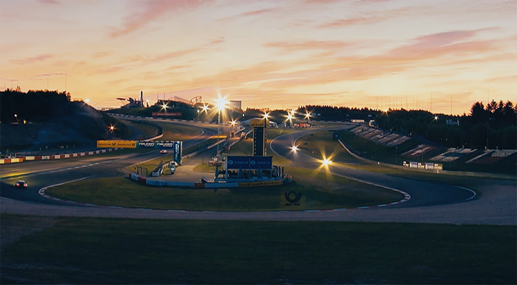
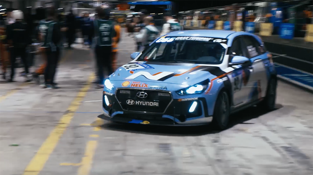
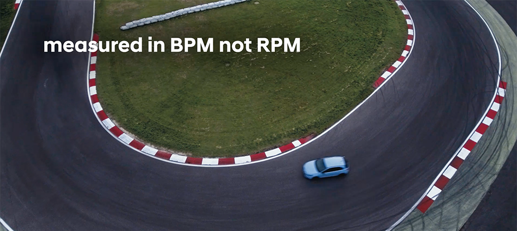
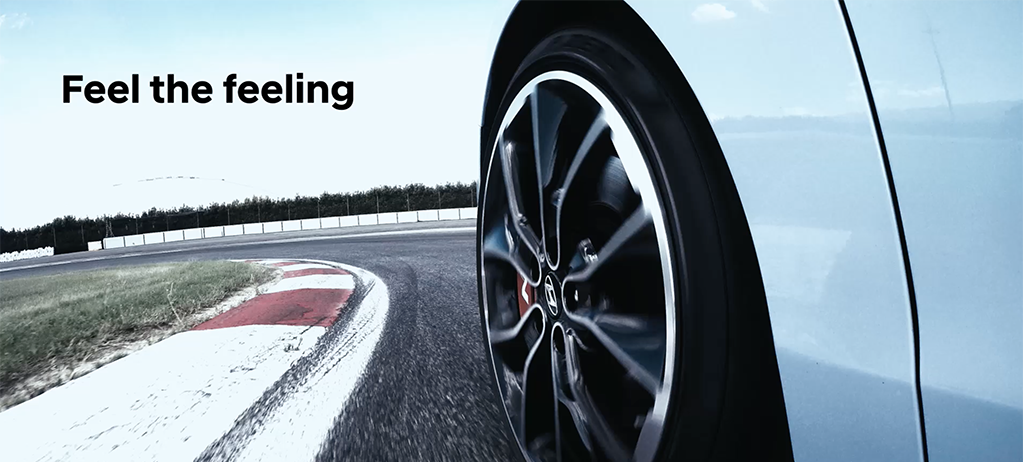
Frankfurt 24HR N Film
From R&D to Race Day! Capturing the precious moments from engineering, track day testing and finally racing. Each second and millimetre is precious to guarantee success in high performance driving.
Urban Sporty
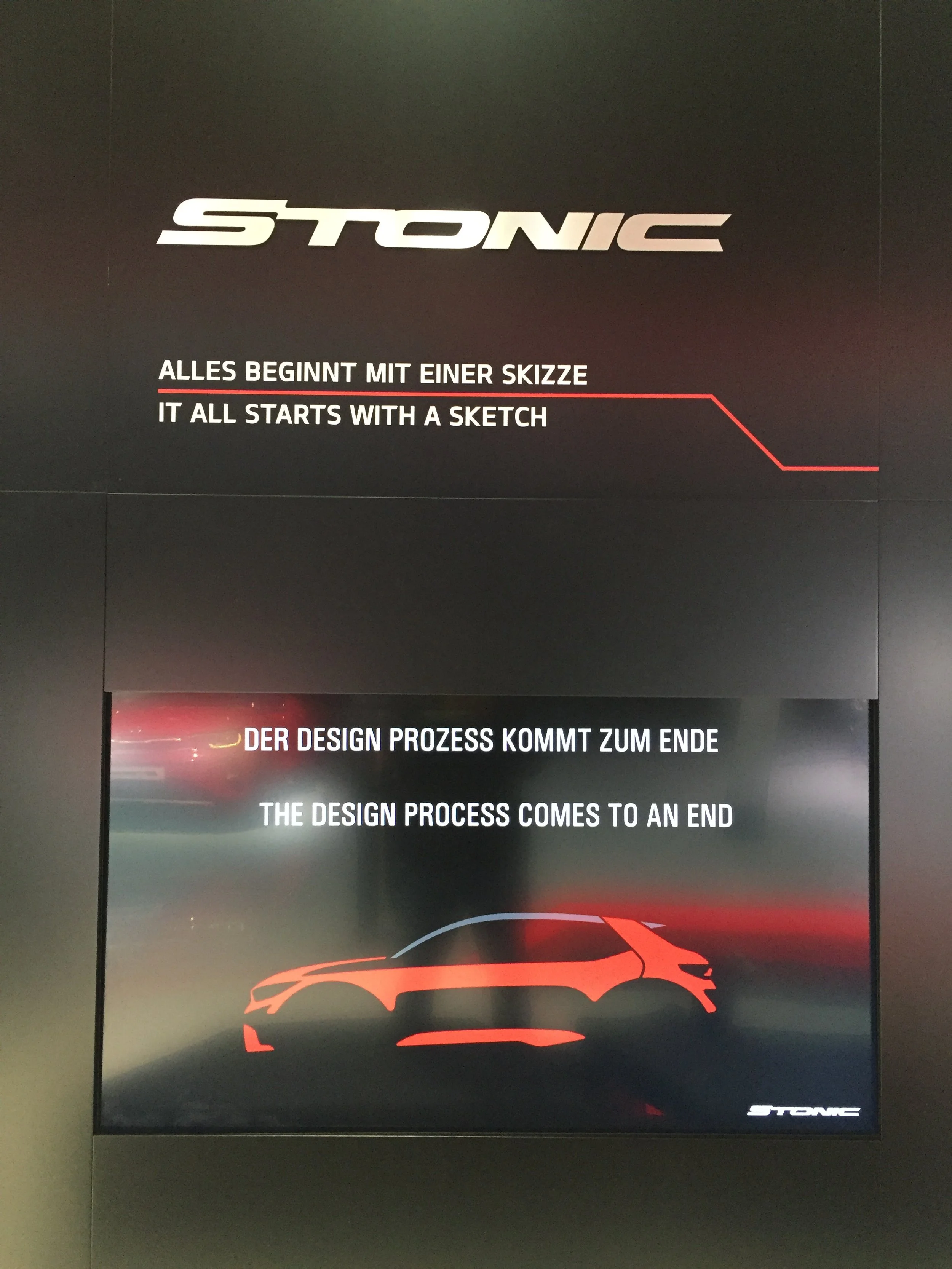
’all-new Stonic’ Debut
Client
Kia
Region
Frankfurt > Europe
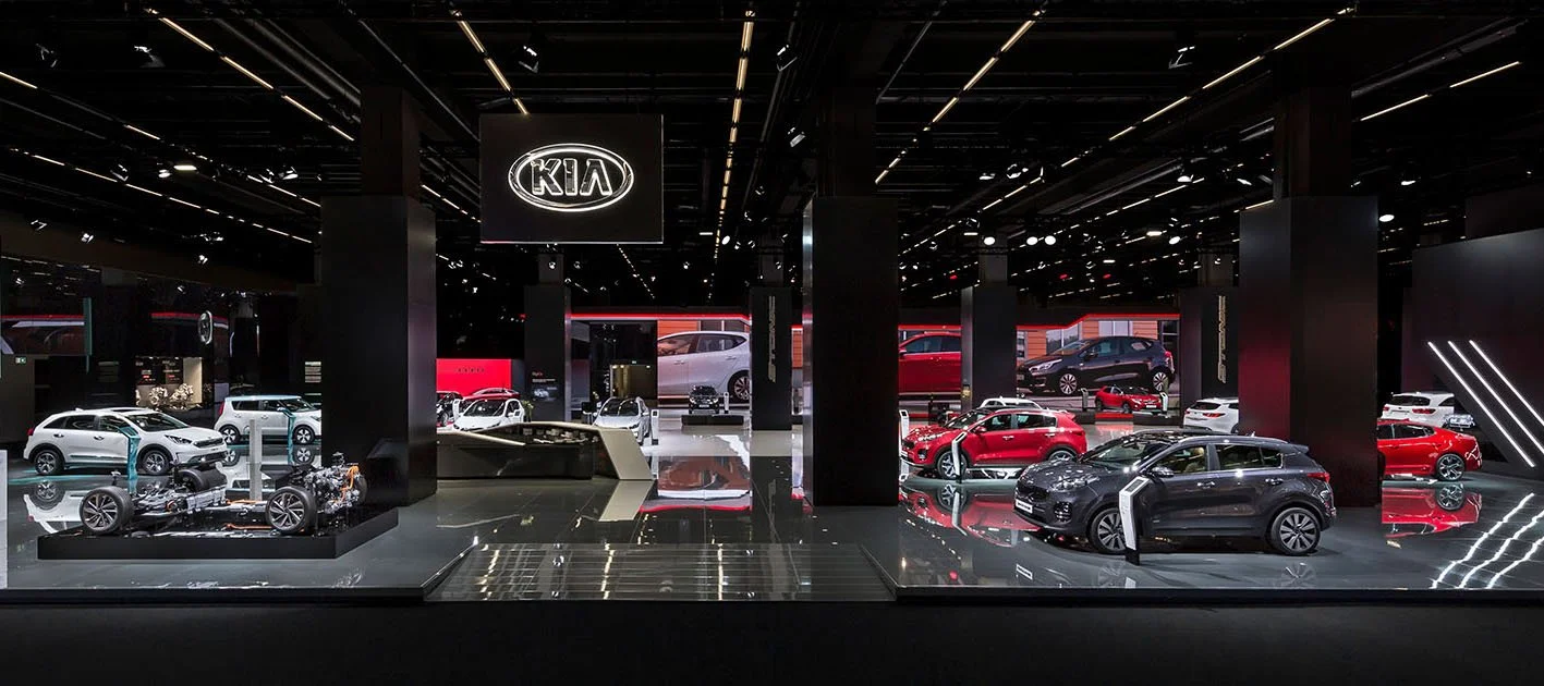
INNOCEAN Worldwide Europe successfully performed the creative development and execution for Kia’s presence at the 67th Frankfurt Motor Show.
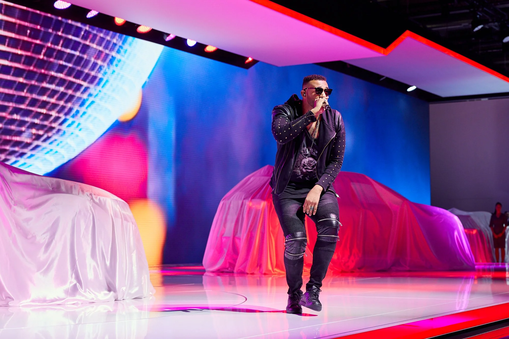
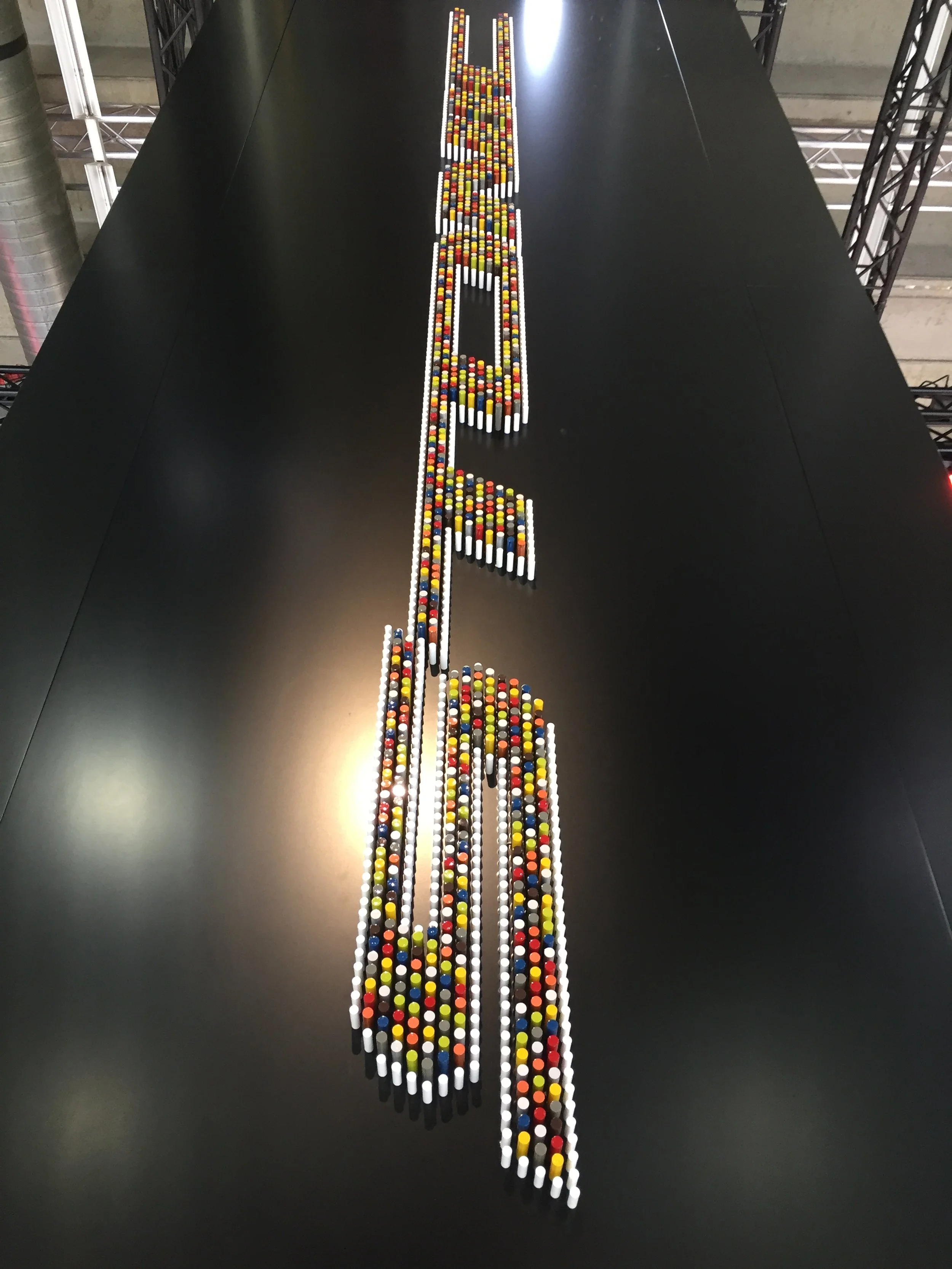
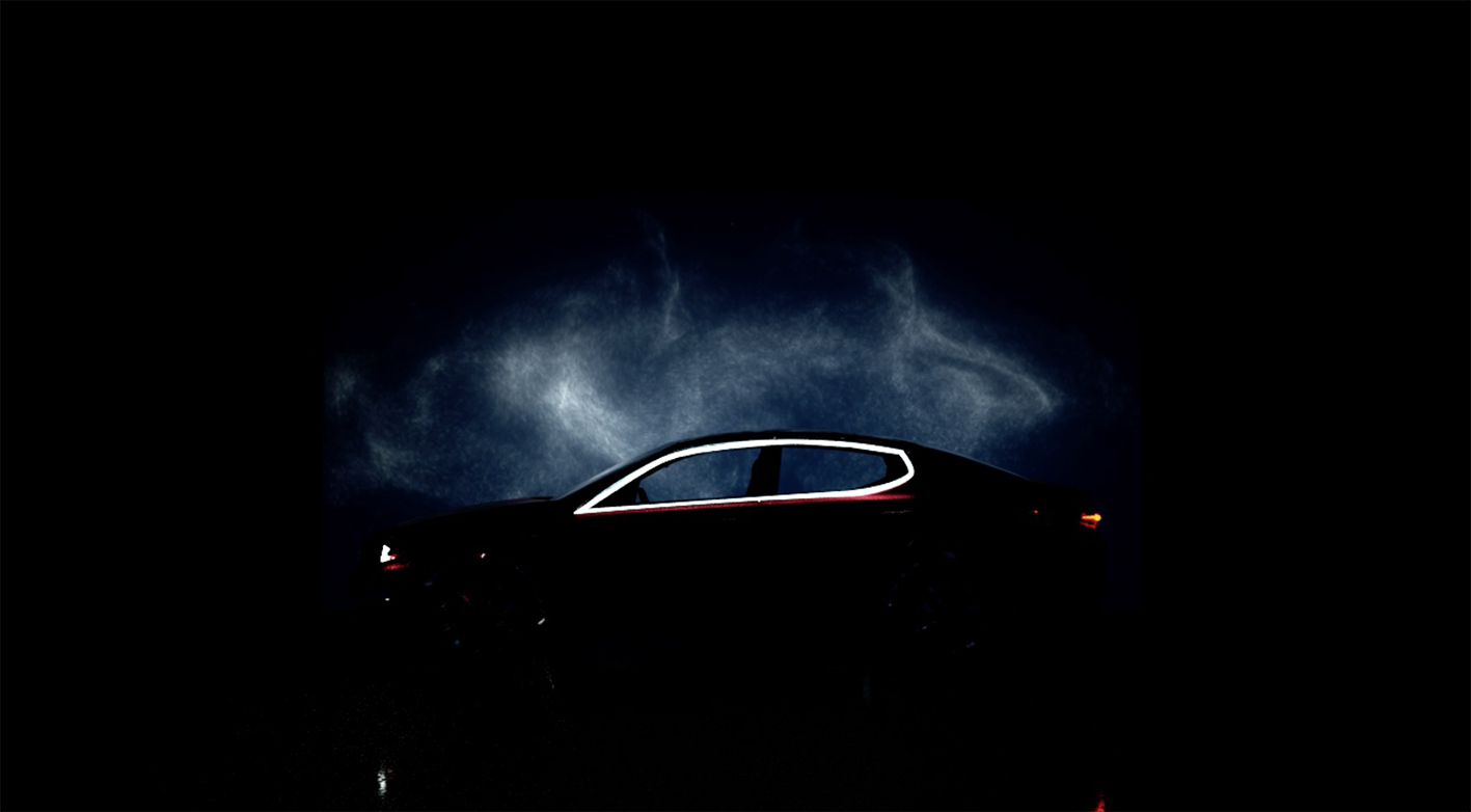
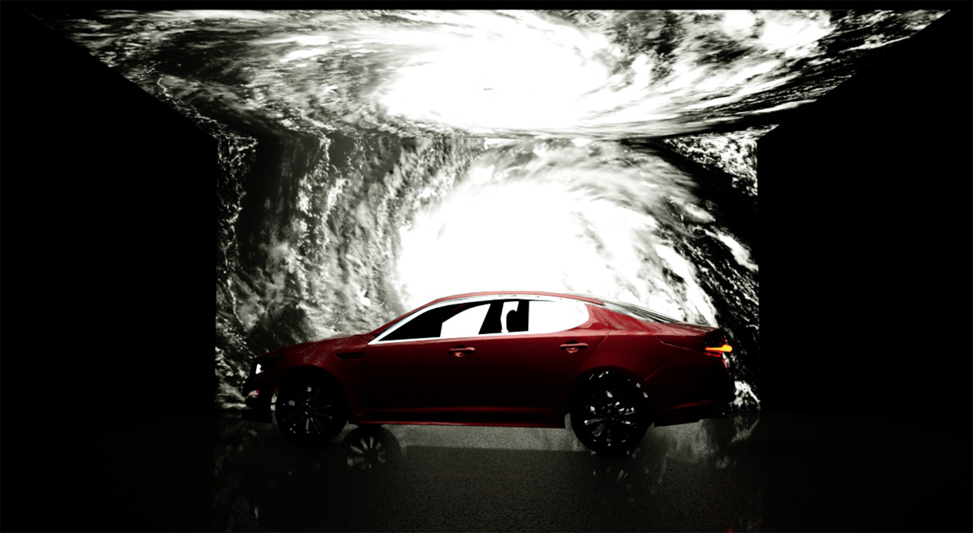
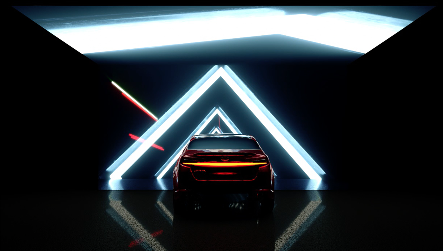
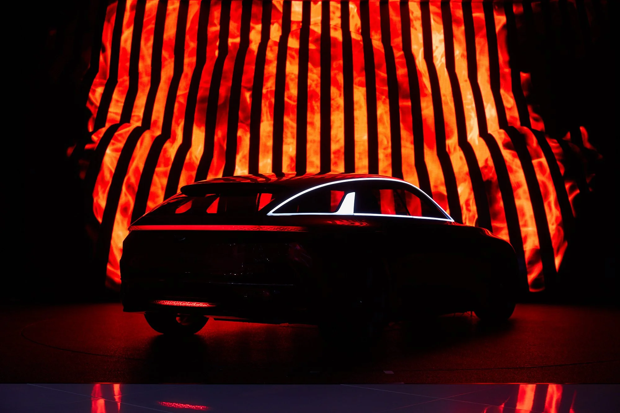
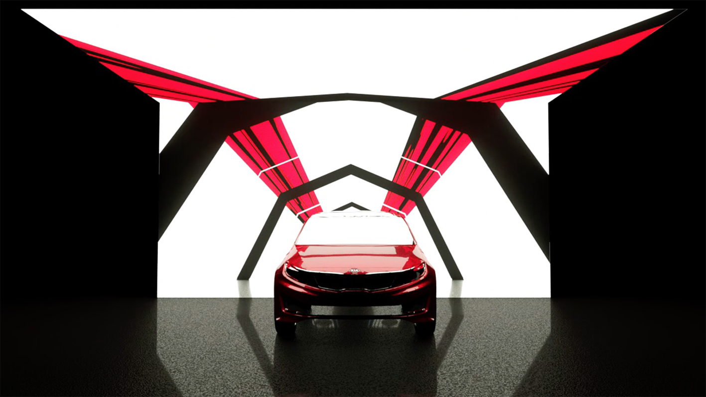
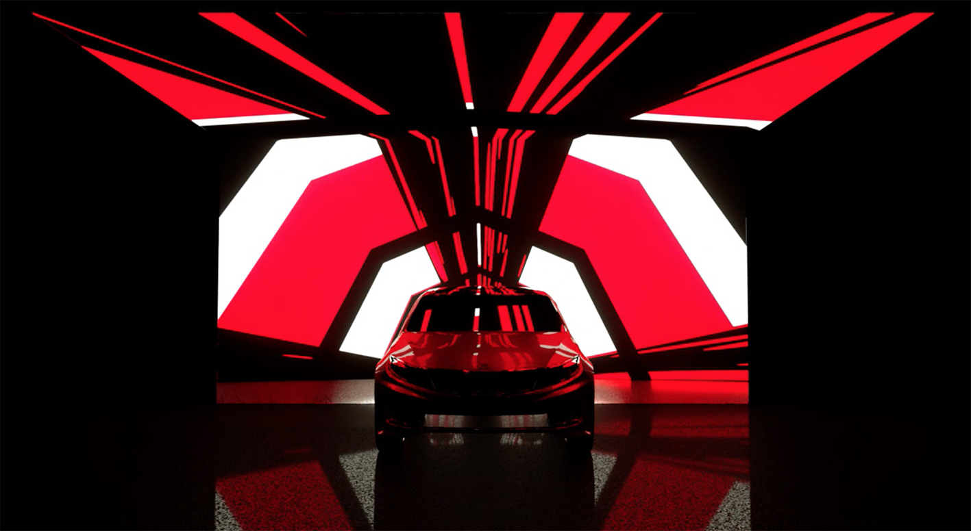
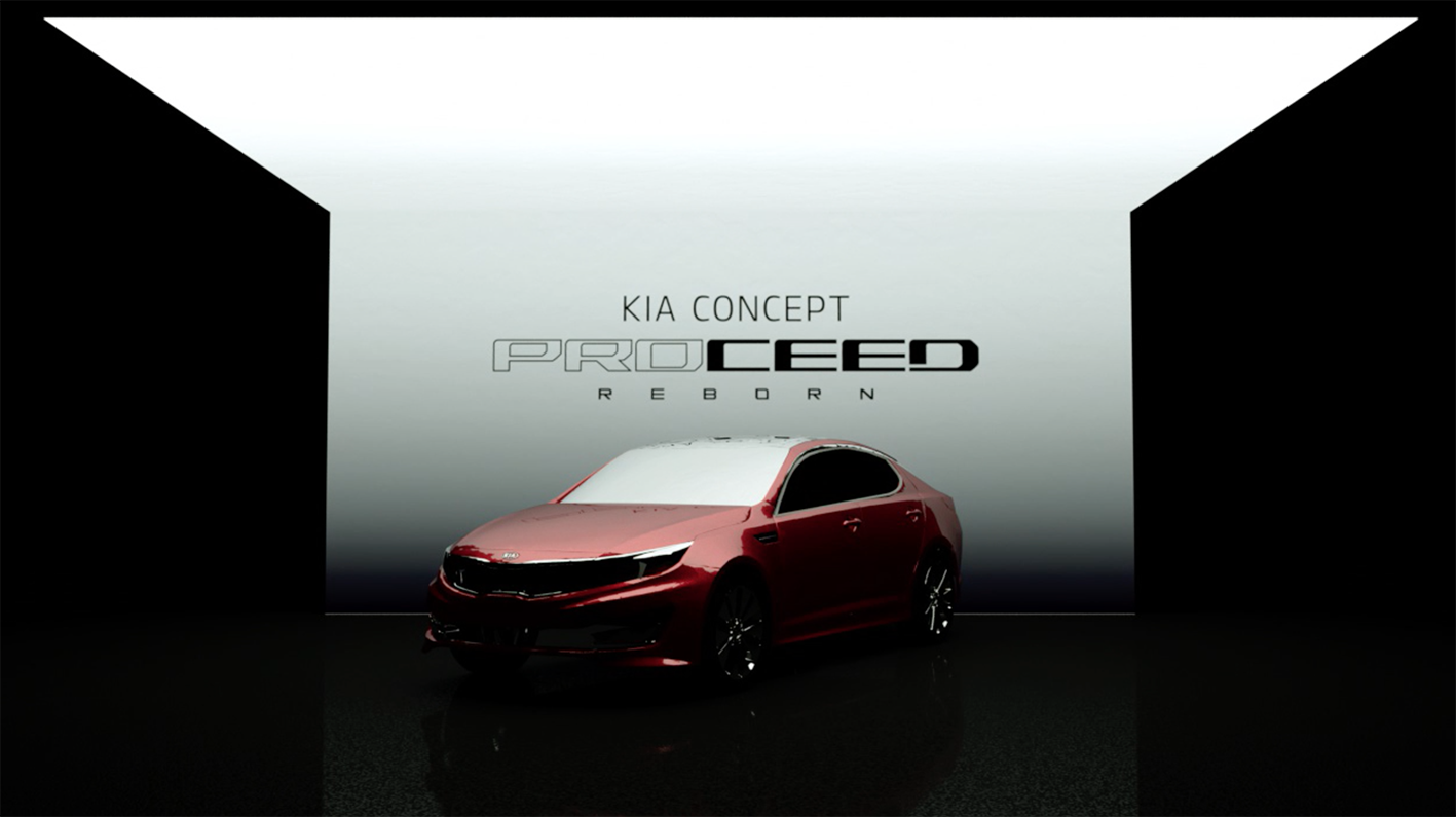
For the press Conference, we created an immersive show with a live rapper preluding the reveal of the all-new Kia Stonic. Kia Motors stole the spotlight with the Kia proceed concept, unveiled on a secondary stage through black threads revealed with a graphic animation backdrop, which was perfectly timed to rotate with the turntable during the launch of the car at the Press Conference.
Overall, the approach throughout all touch points, from film, through digital to architecture, was to express the bold new direction of the brand. As creative director I oversaw all creative development and execution of the press conference, booth architecture, communication design.
Power and Performance
’proceed’ Unveiling
Mood Film
A storyline drawing on the 4 elements moulding the proceed on stage with the LED animating a vortex of graphics shaping the cars character and look.
The soundtrack is based on the cosmos and the sounds created by nature.
A dynamic and powerful unveiling for the international press to be hypnotised.
Motor Show Experience
FE Fuel Cell Concept
Client
Hyundai IONIQ
Region
Geneva > Europe
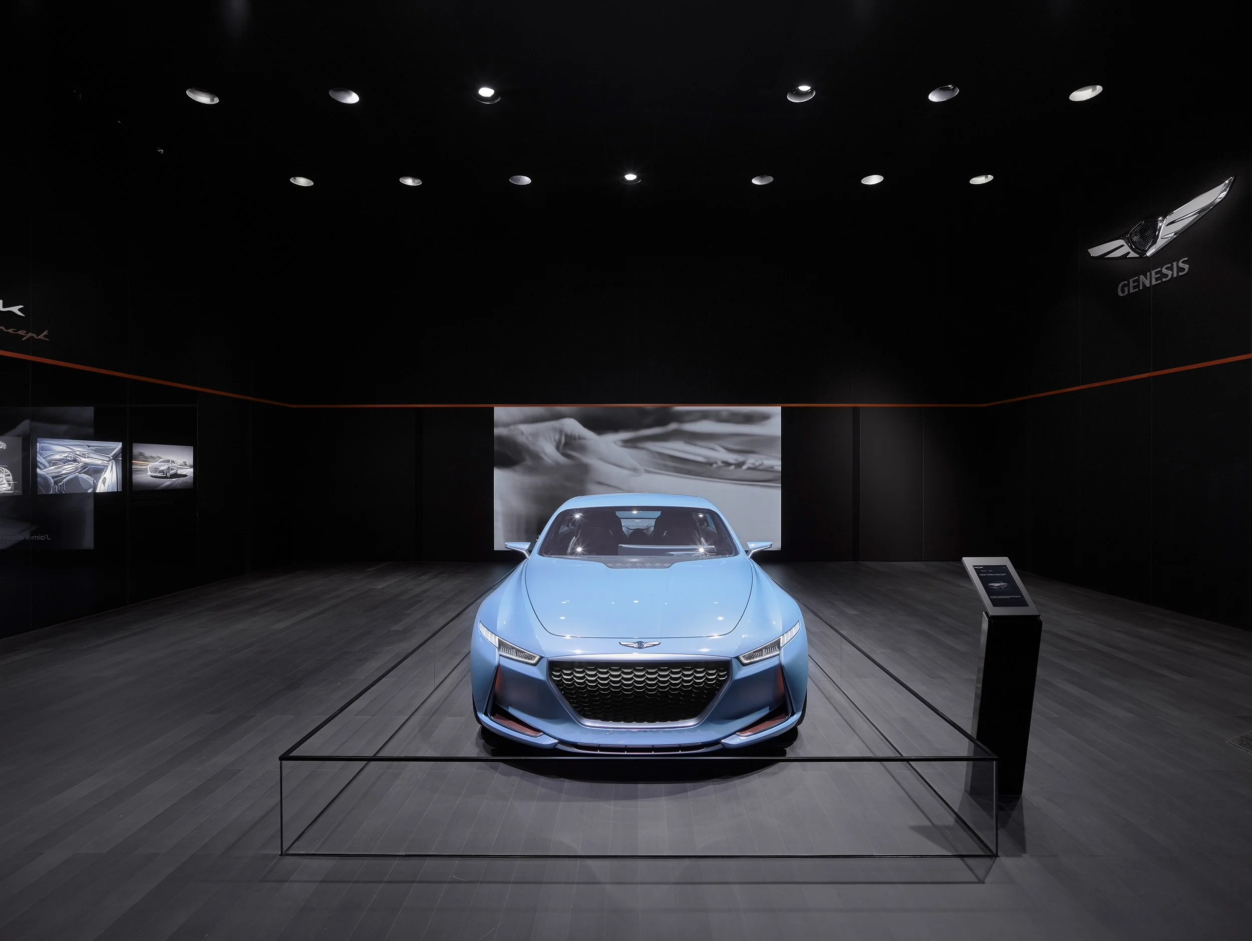
As custodians of the brand our challenge was to define the strategic relevance for each brand at the show by bringing to life key product and brand messaging.
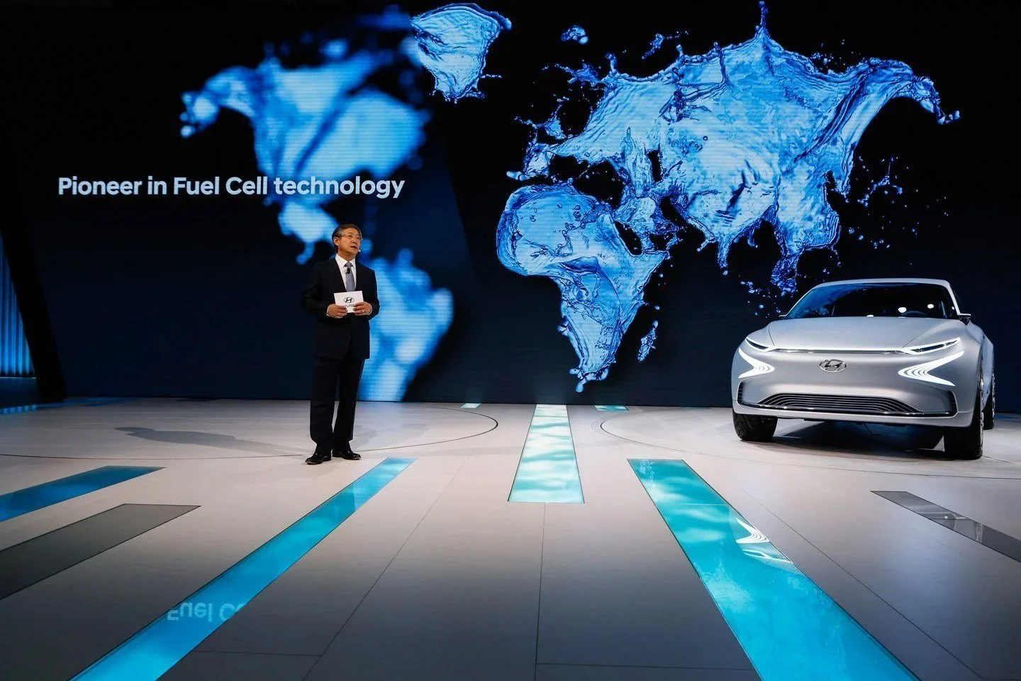
Hyundai launched the i30 Wagon and the FE Fuel cell concept to a global audience and introducing the successful WRC Rally i20, lifestyle and its motorsport spirit.
Our Hyundai booth introduced a new architectural landmark feature named the ‘Water fall effect’, which was positioned within the heart of the booth integrating
a freestanding LED wall and the highlight stage.
Powering the Next Generation
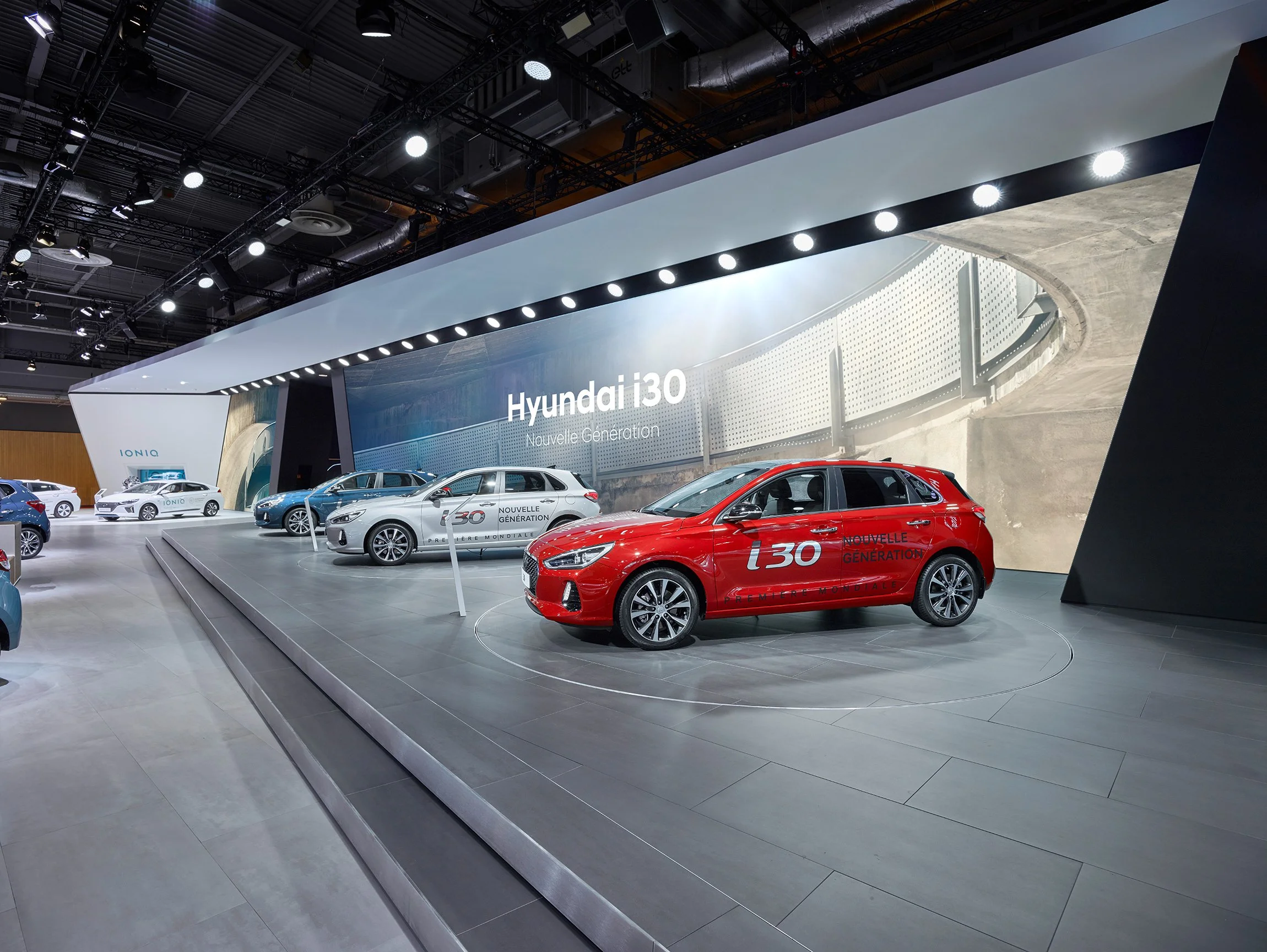
’RN30’ and the ‘all-new i30’
Client
Hyundai
Region
Paris > Europe
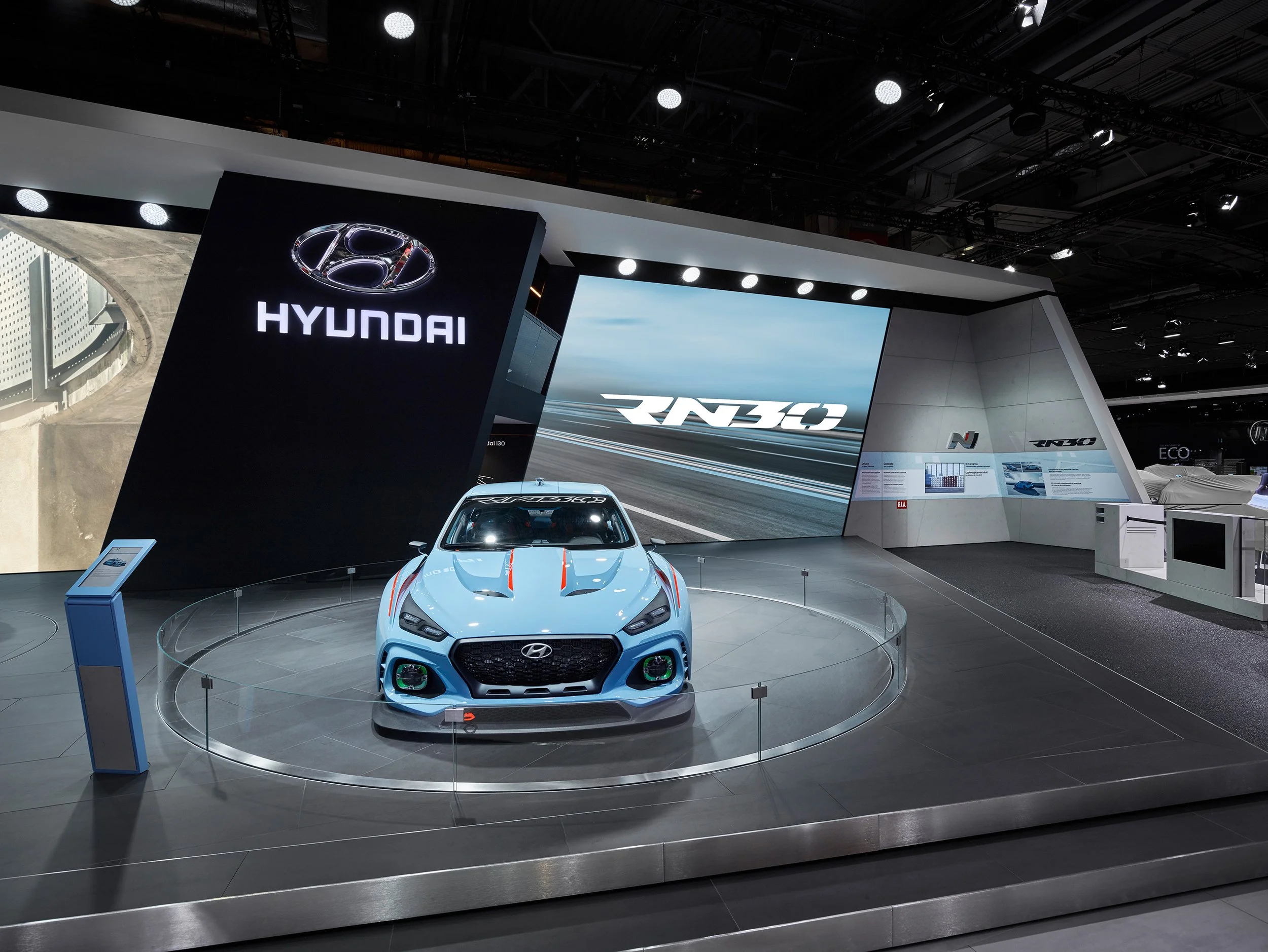
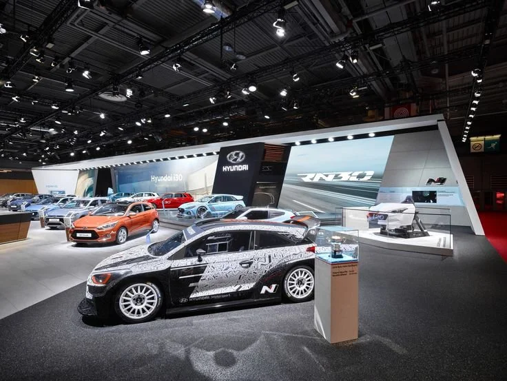
At ‘Paris MotorShow’ we simplified the global common booth design. As the brand required to been seen ‘Simple’ and ‘Premium’.
We filmed 4 key influencer’s the their respect fields of Innovation as this was an integral part of the overall theme. And the mood film for the RN30 concept film which was film both in a studio and on top of the famous Fiat old Lingotto factory in Turin.
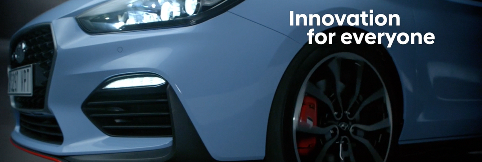
The N Zone is the most revolutionary and exciting for Hyundai and it serves as the platform for Innovation, Technology and engineering towards building the N brand across i20 WRC rally, RM16 Testing car and the highlight of the show the RN30 Concept car, whilst revealing on stage the all-new i30 among the highlights of this year’s motor show for Hyundai.
Powering the Next Generation
’RN30’ Concept Product Film
The mood film for the RN30 concept film which was film both in a studio and on top
of the famous Fiat old Lingotto factory in Turin.
The N Zone is the most revoluting the N brand across i20 WRC rally, RM16 Testing car and the highlight of the show the RN30 Concept car, whilst revealing on stage the
all-new i30 among the highlights of this year’s moto.
Road Show Experience
New IONIQ
Client
Hyundai IONIQ
Region
Amsterdam > Frankfurt Milan >
Oslo > Europe
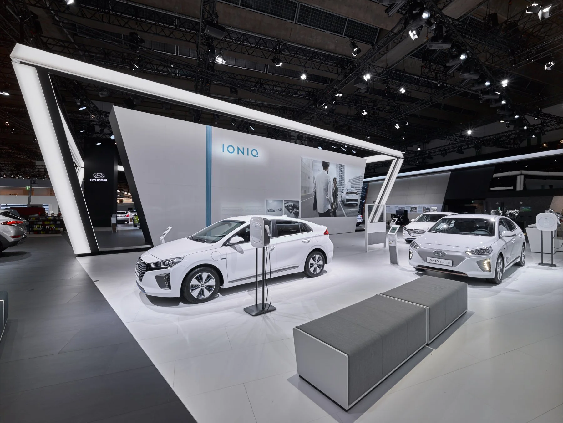
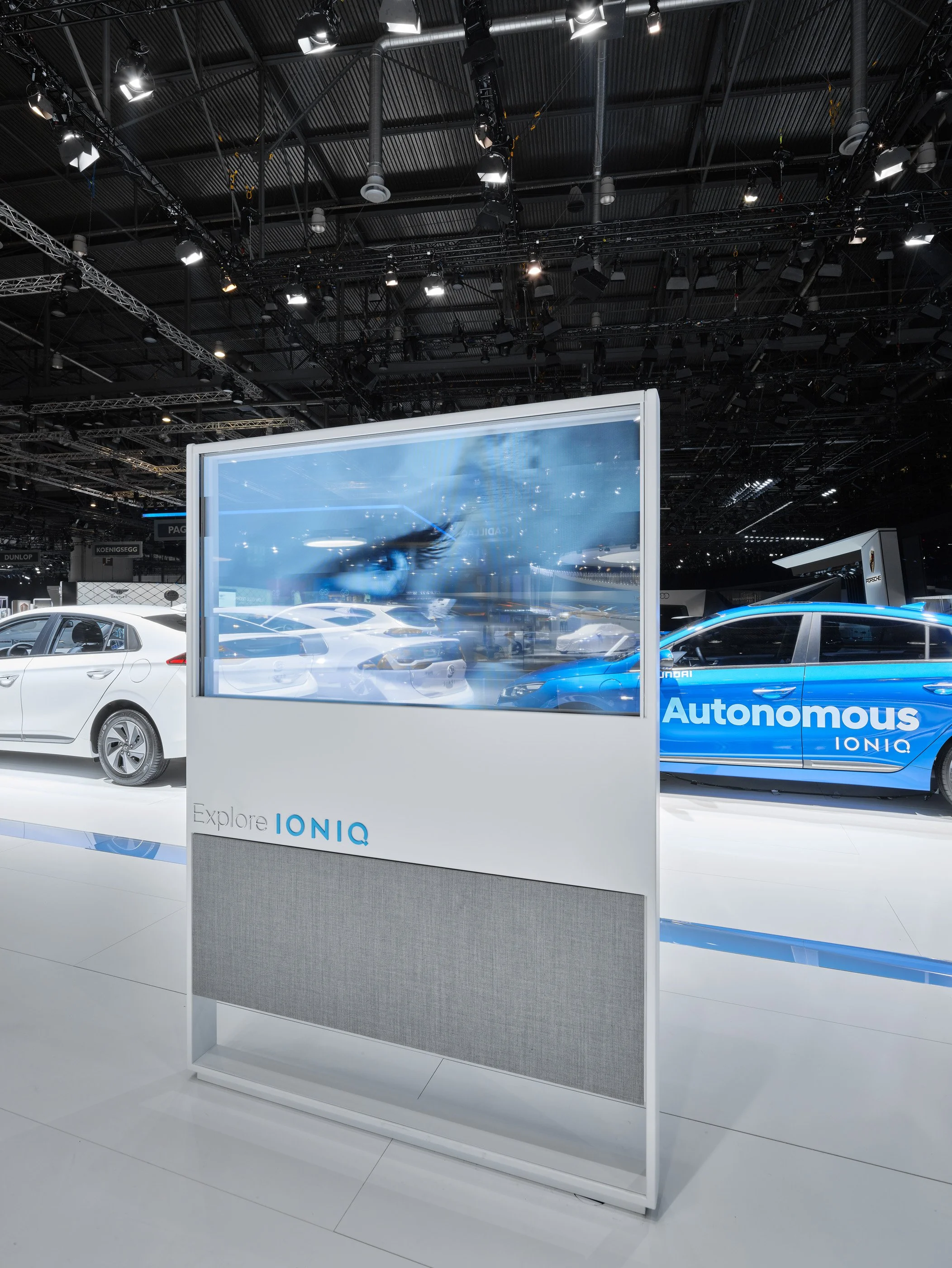
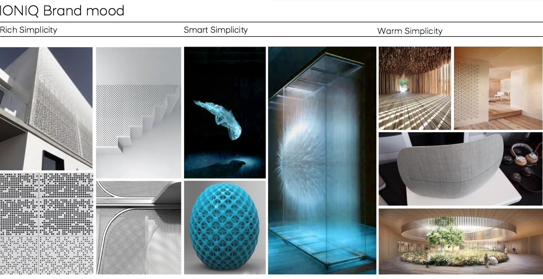
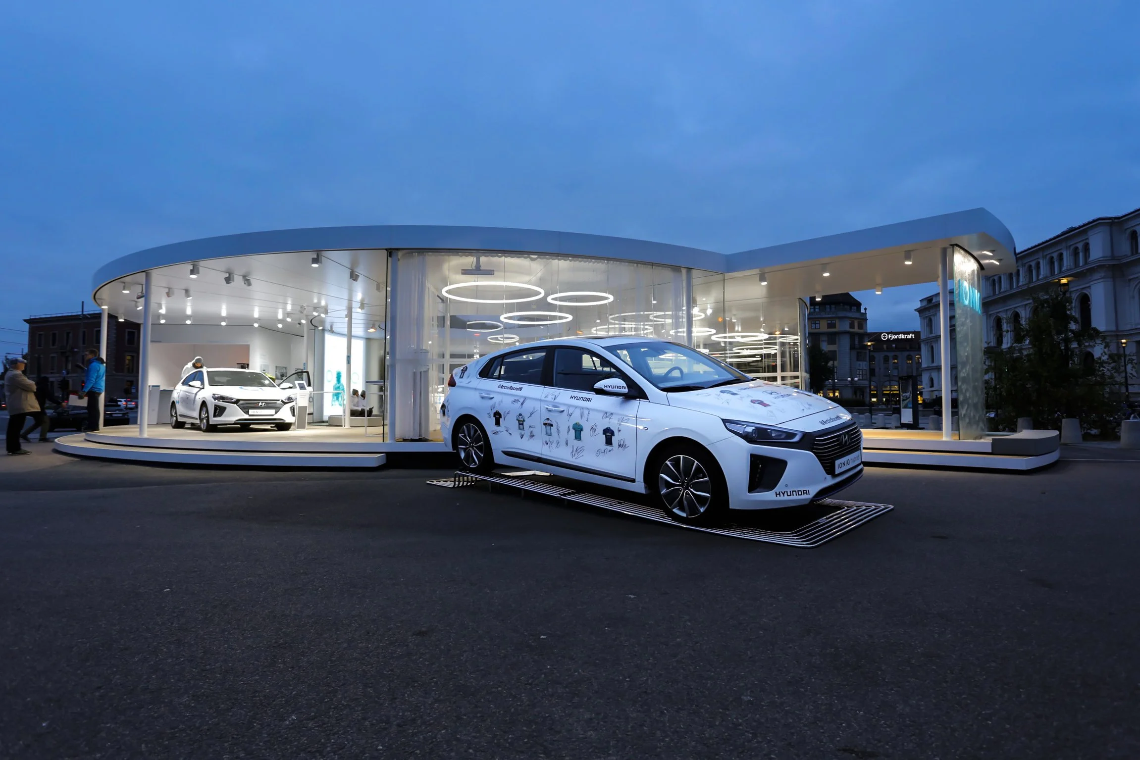
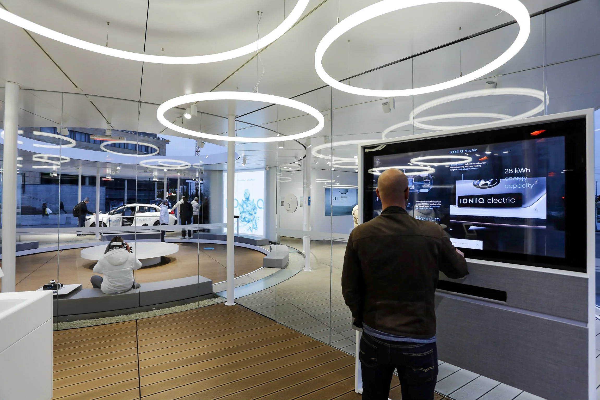
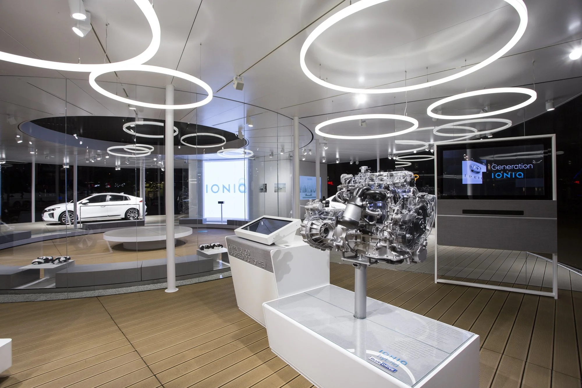
Brand Identity Hyundai Motor Corporation was looking for a new promotional platform designed to increase brand awareness for the introduction of the IONIQ first Eco models in Europe.
Idea To offer customers a technically convincing and emotionally reaching experience by installing a temporary, but visually fascinating pop-up space covering four significant European cities in terms of Eco models (Frankfurt, Amsterdam, Oslo and Milan).
Goals To enhance initial awareness of the IONIQ brand in the European market by offering an IONIQ experience which reflects Hyundai’s holistic approach against the mobility paradigm shift.
Launching in Amsterdam
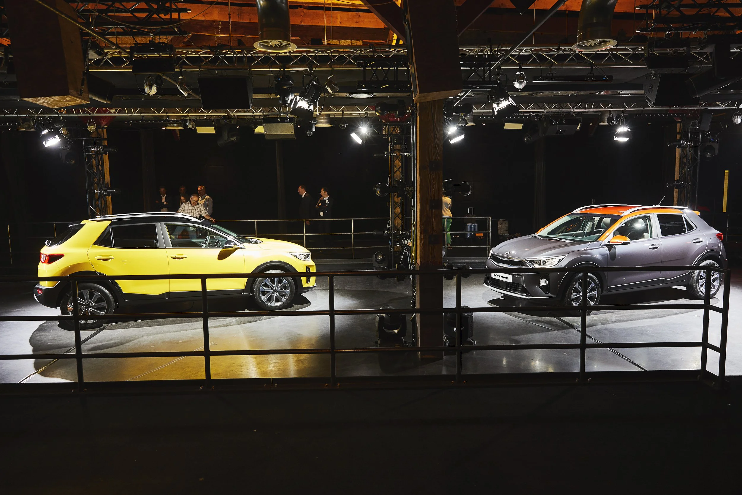
‘All-New Stonic’
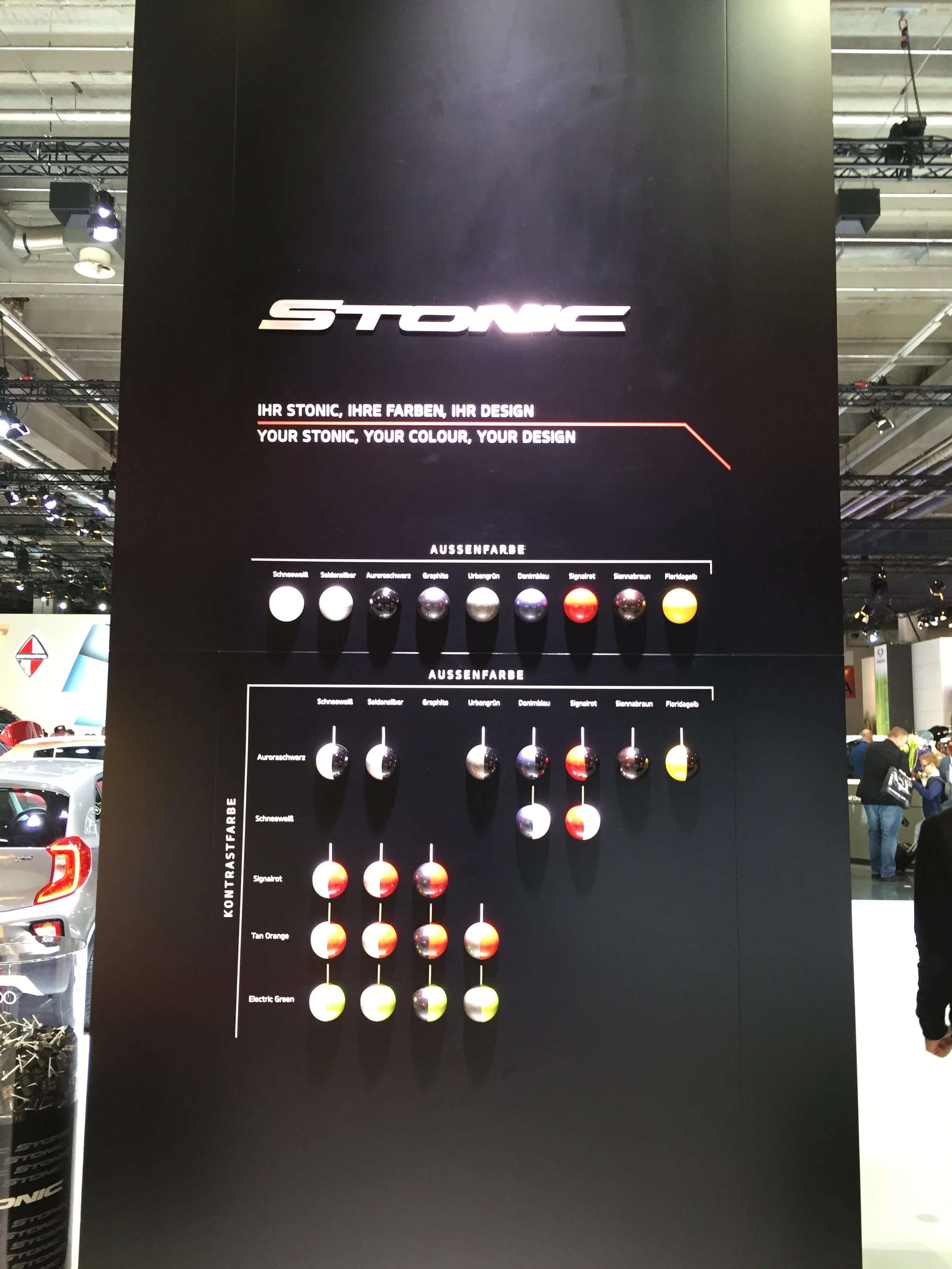
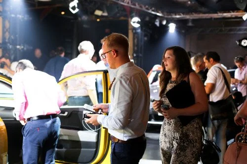
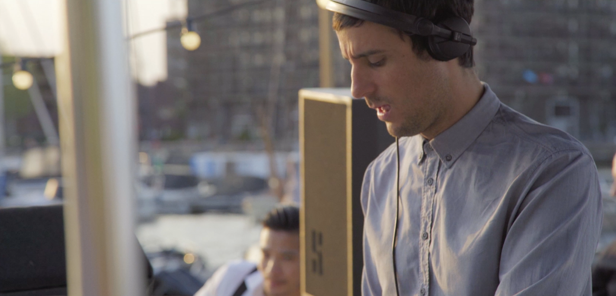
Kia continues too build its brand as an emerging Asian brand in Europe. The fun never stops! This time we took the Kia journey to Amsterdam and back in a day for the launch of the brand new Kia Stonic Compact Crossover. Set in The Harbour Club, Amsterdam. The venue was a hive of activity, swarming with members of the automotive press from across the globe, all waiting to feast their eyes on Kia’s latest sporty offering.
Our aim was to locate and create a new brave non-corporate event. Seeking out an urban chilled-out environment with local Dutch artist, DJ, Chefs and Film Directors.
Client
KIA
Region
Amsterdam > Pan European
Finance Brands
‘A seamless customer journey for greater consumer experience
delivering through personalised
and digital means’
Personalised Banking
Personalised Banking
Client
Al Hilal
Region
UAE > Gulf
Project
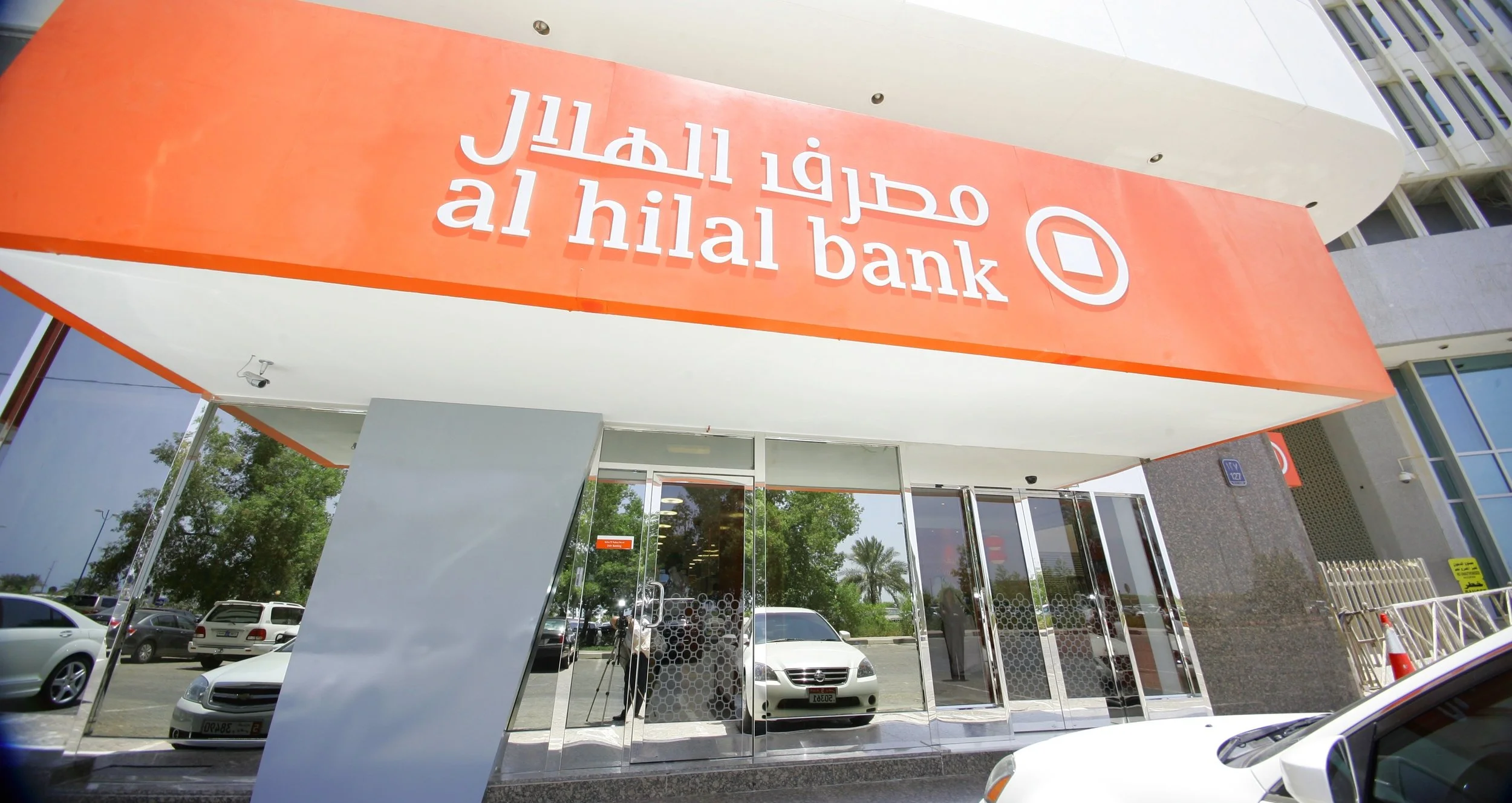
Al Hilal Bank
Context
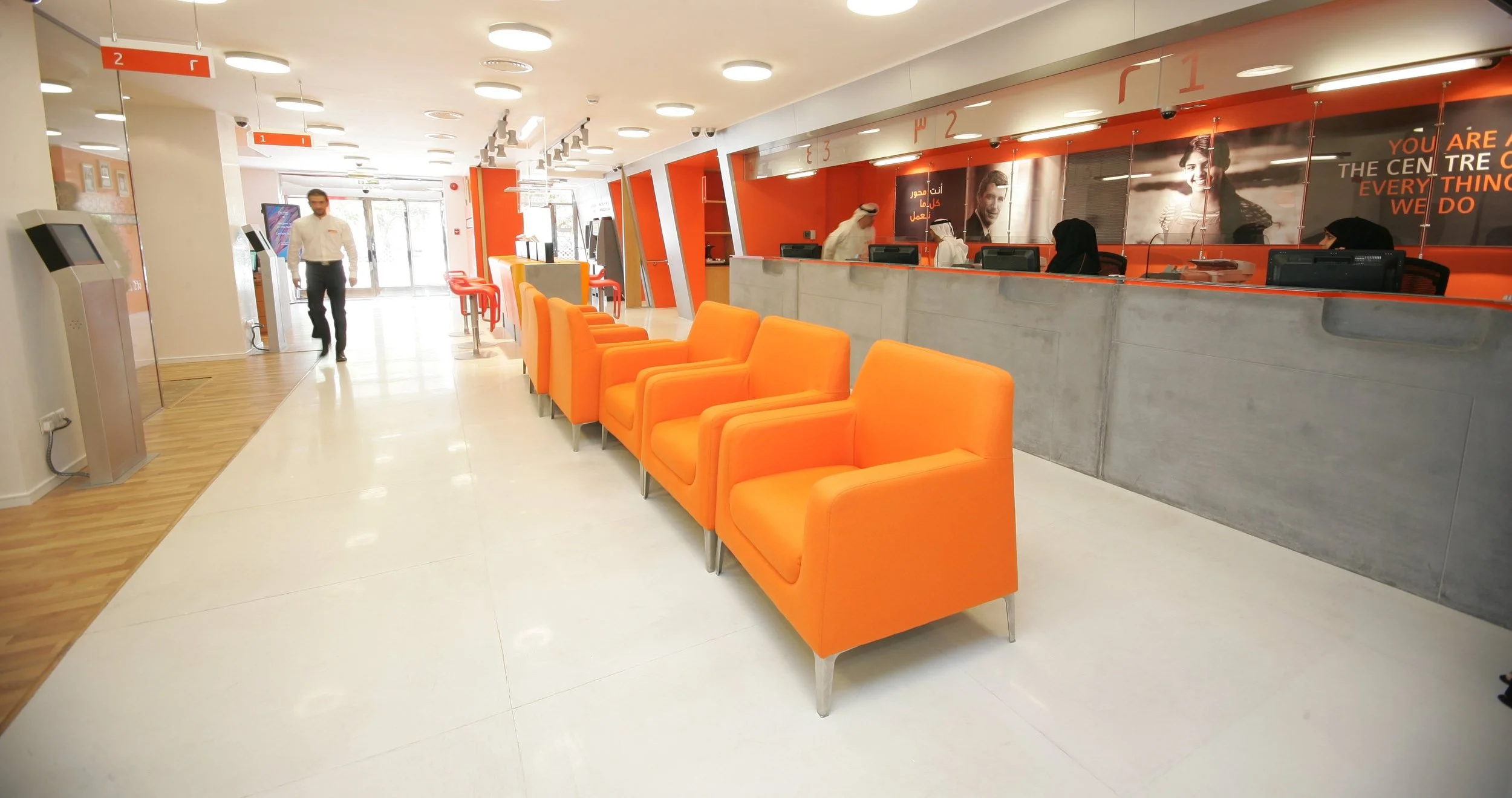
Define a full Service Islamic Bank based on moderate Sharia Banking Law
Challenge
The banking industry has suffered from fiscal policies that have meant continual cutbacks on staff in an effort to become more profitable. The result has been a gradual shift towards unfriendly automated services and less interaction with people.
Solution
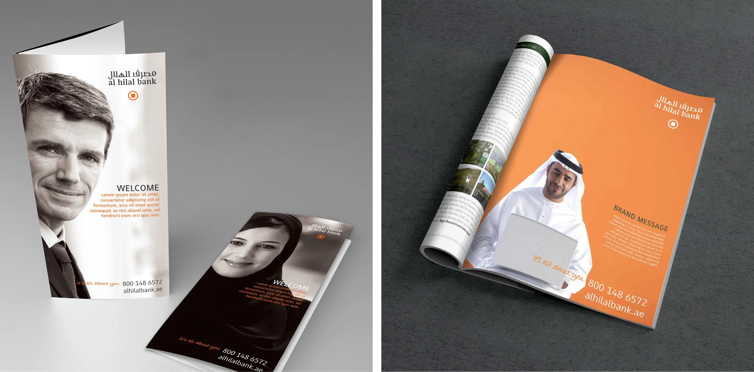
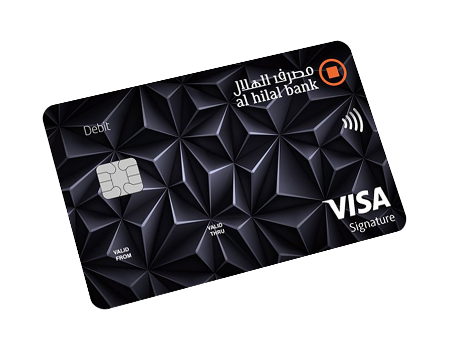
We created a fresh and sophisticated full-service commercial bank based in the United Arab Emirates. Driven by Shariah compliance, by created a simple iconic logo and warm tones it reflected the banks progressive financial products and personalised services to build value for all customers and key stakeholders.
Al Hilal Bank brand system allows products to Retail and Corporate Customers as well as Investment and Advisory services. To be easily adapted into the brand architecture. “The brand created for Al Hilal Bank has set a new approach and benchmark for the banking industry.
Retail Experience
Breaking Convention
Client
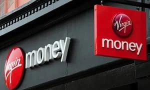
Virgin Money Store
Region
UK
Project
Retail Experience
Overview
Virgin Money commissioned to develop
a retail bank design for their first physical presence on the high street. At a time of high consumer disillusionment with banks, Virgin Money took the opportunity to launch a store concept that would make customers feel special, at ease, by embodying their unique philosophy: ‘Everyone’s Better Off’. Taking inspiration from the layout and interior details of an imagined Virgin Money home, the store invites longer dwell time through its central sitting room, open lounge booths and kitchen bar area where customers can relax, surf and chat with the store hosts.
As Virgin Money rolls out the store concept, customer acquisition continues to grow as consumers seek-out a retail banking provider with a strong, positive differentiation. Together we have created an innovative concept built upon a simple back-to-basics financial retail proposition that puts the importance back on the customer.
Challenge
Create brand awareness. Bring Virgin Money to the high street. Develop a truly unique experience. Deliver customer acquisition and cross-sell to existing customers. Revolutionise the traditional banking environment. Re-brand existing branch network.
Solution
Unique retail concept embodying the Virgin brand personality. Customer experience embodying Virgin Money brand philosophy ‘Everyone’s Better Off’.Signage, windows and ‘quick win’ interior re-brand scheme.
Result
Well received by existing customers and substantial new account openings. Blueprint for network wide roll out. Virgin Money has high street presence. Halo effect attracting new customers.
Premier Banking
Accessibility
Client
Vietnam bank
Region
SE Asia
Project
Brand revitalisation
Challenge
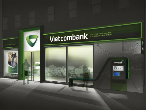
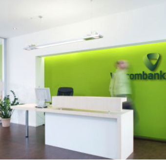
The new brand image and branch environment will greatly enhance the customer experience for the bank’s clients and will also bolster Vietcombank’s objective to become the largest group in non-Japan Asia by 2020 as a multi-functional financial group with international banking standards.
Solution
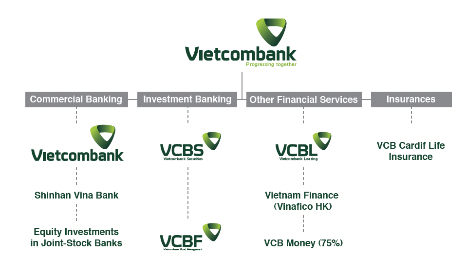
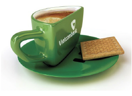
The new logo of Vietcombank maintains their traditional green reference to the power of nature, showing growth through the balanced development of standards, and the desire to expand and reach out. The letter V in the logo was redesigned as a modern, stylized icon, linked throughout, demonstrating a successful sustainable connection. It not only symbolizes ‘V’ in VCB but also a symbol of the spirit to win. The new logo of Vietcombank maintains their traditional green reference to the power of nature, showing growth through the balanced development of standards, and the desire to expand and reach out. The letter V in the logo was redesigned as a modern, stylized icon, linked throughout, demonstrating a successful sustainable connection. It not only symbolizes V VCB but also a symbol of the spirit to win (V victory), the union of the heart with faith comes from the heart for a shared future with the prosperity of Vietnam (V victory), the union of the heart with faith comes from the heart for a shared future with the prosperity of Vietnam.
Driven by Knowledge
Independent Traders
Client
Wolfgang
Region
EIRE > Europe
Project
Brand Creation
Overview
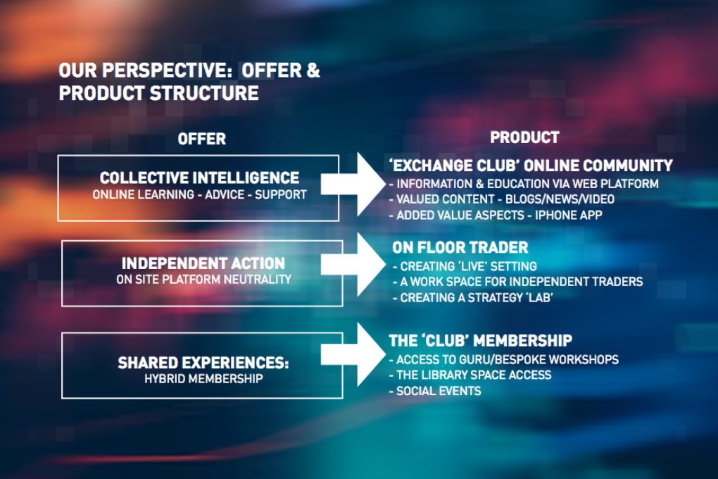
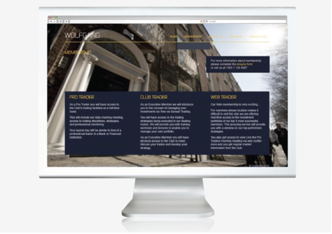
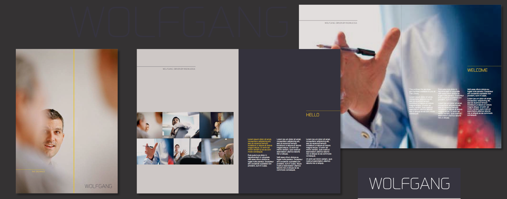
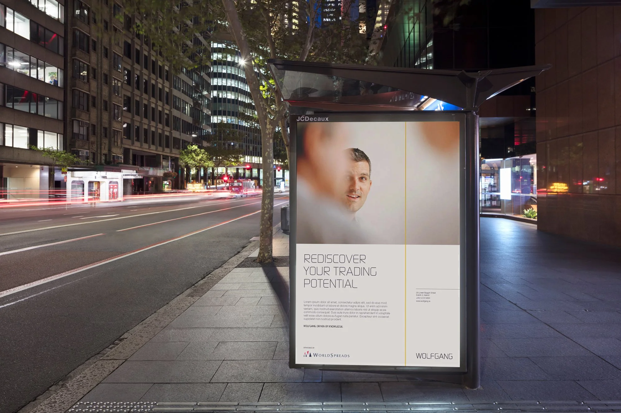
Large Irish trading institutions such as Davy’s, Goodbodys and NCB are in a negative place. Due to large redundancies, losses people incurred on their property portfolios and a general distrust that has crept into the Irish psyche, these old institutionalized trading environments are being questioned and there appears to be a growing distrust of these businesses. Wolfgang have identified a new fresh space in the Irish market and plan to bring an independent trading environment to Dublin. Out of eteursa three story building on Baggot Street, Wolfgang will simulate a trading environment for a mix of people from those made redundant from the larger institutions to postgraduates that are just out of college. However, Wolfgang is more than a trading environment, it will provide its clientele and members with a full education on Spread Trading, how to read and follow the markets and ensure that all of their members leave with an ability to make money from Spread Trading. WOLFGANG. DRIVEN BY KNOWLEDGE
Challenge
Create brand awareness. Bring Virgin Money to the high street. Develop a truly unique experience. Deliver customer acquisition and cross-sell to existing customers. Revolutionise the traditional banking environment. Re-brand existing branch network.
Solution
Unique retail concept embodying the Virgin brand personality. Customer experience embodying Virgin Money brand philosophy ‘Everyone’s Better Off’.Signage, windows and ‘quick win’ interior re-brand scheme.
Result
Well received by existing customers and substantial new account openings. Blueprint for network wide roll out.. Virgin Money has high street presence. Halo effect attracting new customers.
Premier Banking
Accessibility
Client
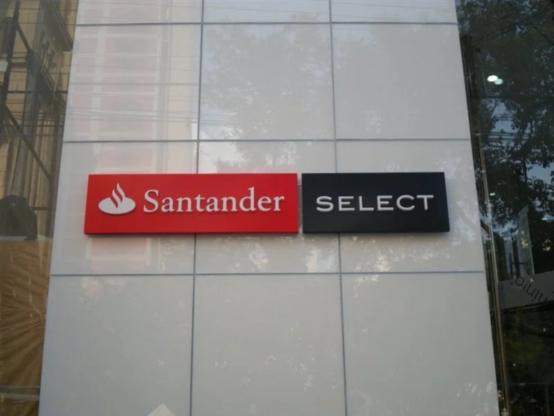
Santander Select
Region
Central and Latin America
Project
Santander Select (Private banking)
Overview
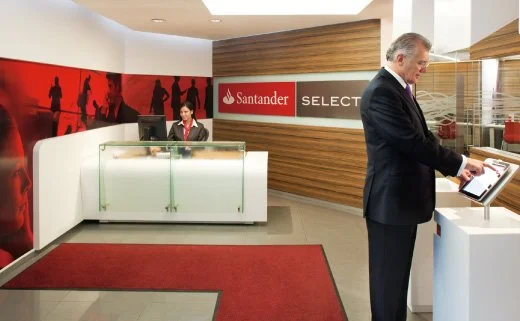
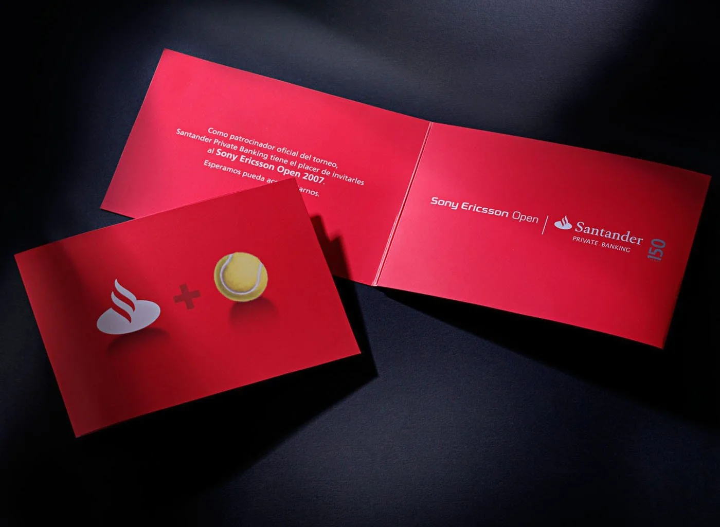
New opportunities for affluent customers? That was our thinking when we responded to Santander’s brief to make their premier banking offer less corporate and more contemporary. For Latin America’s leading bank we created a unique retail bank design environment which would also be used for seminars, social events and networking. It would also showcase complementary art, fashion and technology lifestyle brands. The it as a template for their Premier branches worldwide.
Challenge
Less corporate, more contemporary environment. Attractive to affluent customers.
Solution
Unique lifestyle brand showcase pods. Hub for seminars, social gatherings.
Result
‘Select’ template now used worldwide.
Premier Banking
Digitally Driven
Client
ABSA
Region
South Africa
Project
Retail banking Communication
Overview
Creating a conceptual test-lab branch Absa wanted to create a more interactive environment for customers whilst promoting and testing new ways of banking. They appointed Allen international to develop a conceptual test-lab branch at Clearwater Mall located just outside Johannesburg. The bank wanted to use the new branch to develop innovative products and processes prior to rolling them out across the entire branch network.
By creating different customer journeys for exclusive banking, retail consultation and high-traffic transactional banking we were able to deliver a focused and efficient solution, enhancing the customer experience with quick-service pods, Microsoft Surface tables and a dynamic and engaging 25-metre-long digital screen. The main banking space itself was intended to be used for Absa customer initiatives such as group purchase promotions and community engagement as well as showcasing the bank’s sponsorship activities.
Challenge
Attract more customers. Create interactive environment. Make branch engaging.
Solution
Tablet ‘Forest’ of testimonials to create interest with customers. 25 meter long digital screen for news and product communications. Quick-service pods.
Result
38% increase in revenues. Increase in affluent customers. 3rd party retail partnership area very successful. Concept being rolled out to Hyde Park and other branches.
Brand Identity
‘Distinguishing brands
in consumers minds’
Progressive Cleaner Future
Cleaner Energy
Client
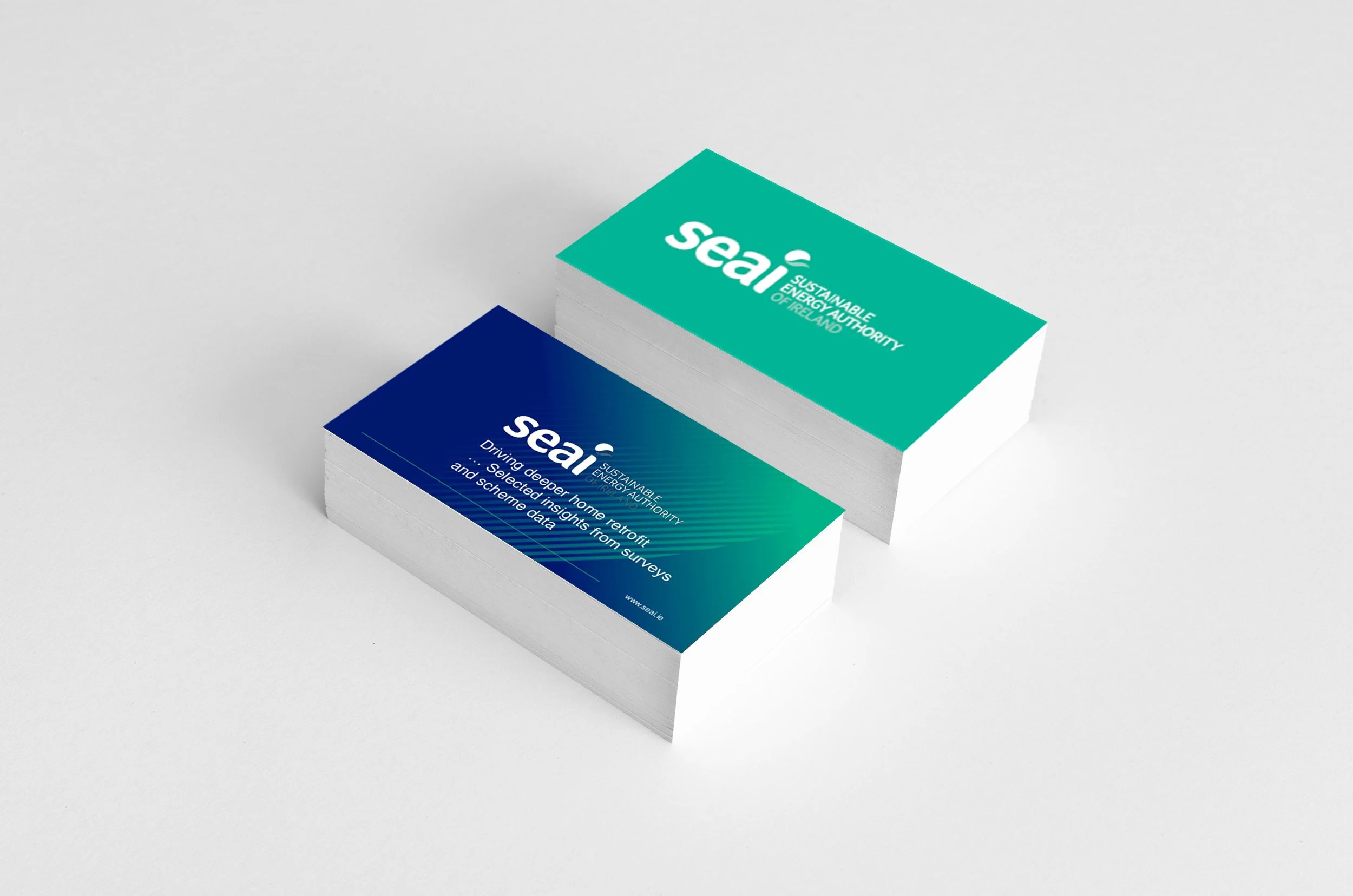
SEAI
Region
EIRE > Europe
Project
Identity refresh
Context Creating a cleaner energy future for Ireland
Challenge Change the perception from a passive entity to a progressive Energy authority.
Solution
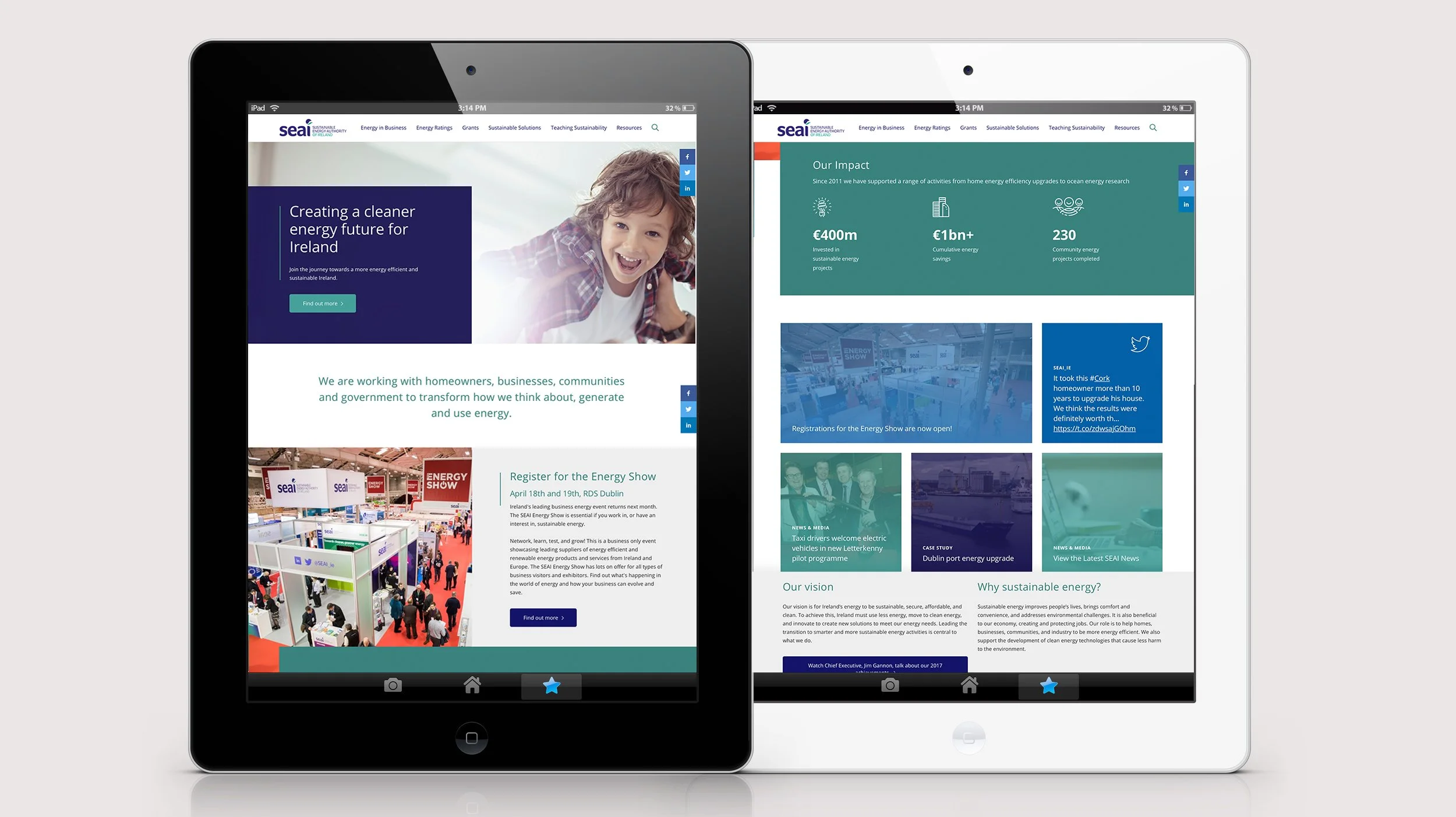
We were asked to look at creating a brand identity and full range collateral communication program with a rich library of assets covering illustration, imagery and icons. The brand needed to work hard on a collective of different levels. ‘Smart’, ‘Friendly’ and Progressive’.
Previous Identity
Current Identity
Center of Excellence
National Vision 2030
Client
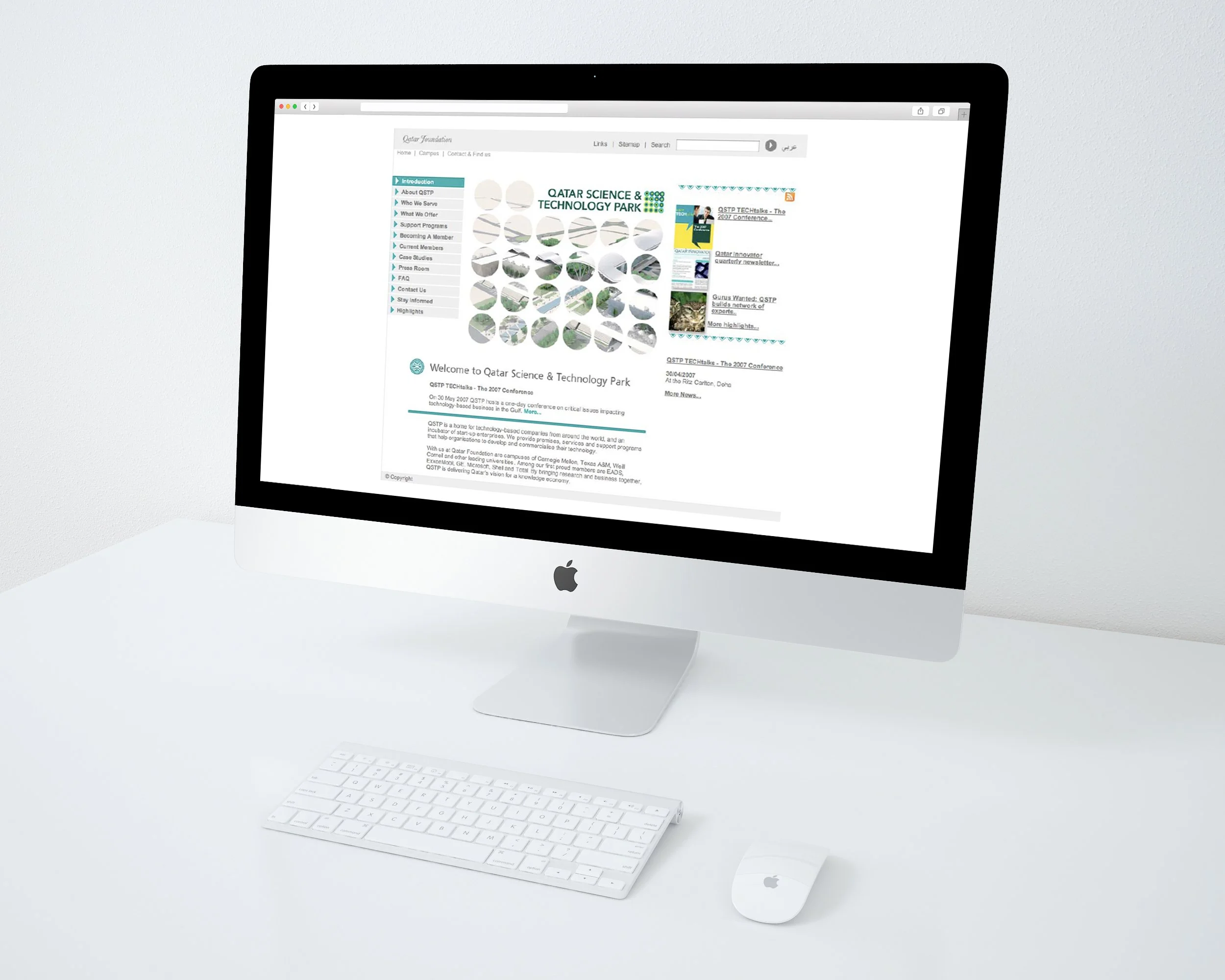
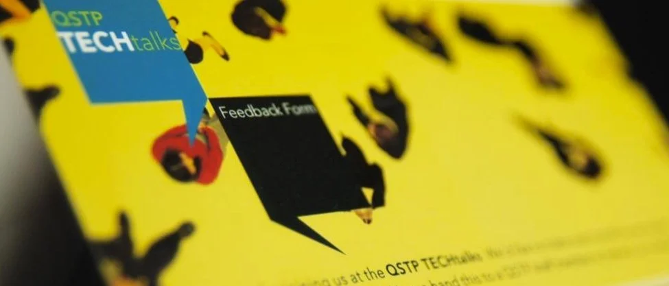
Qatar Foundation - QSTP
Region
Qatar
Project
Brand Identity
Overview
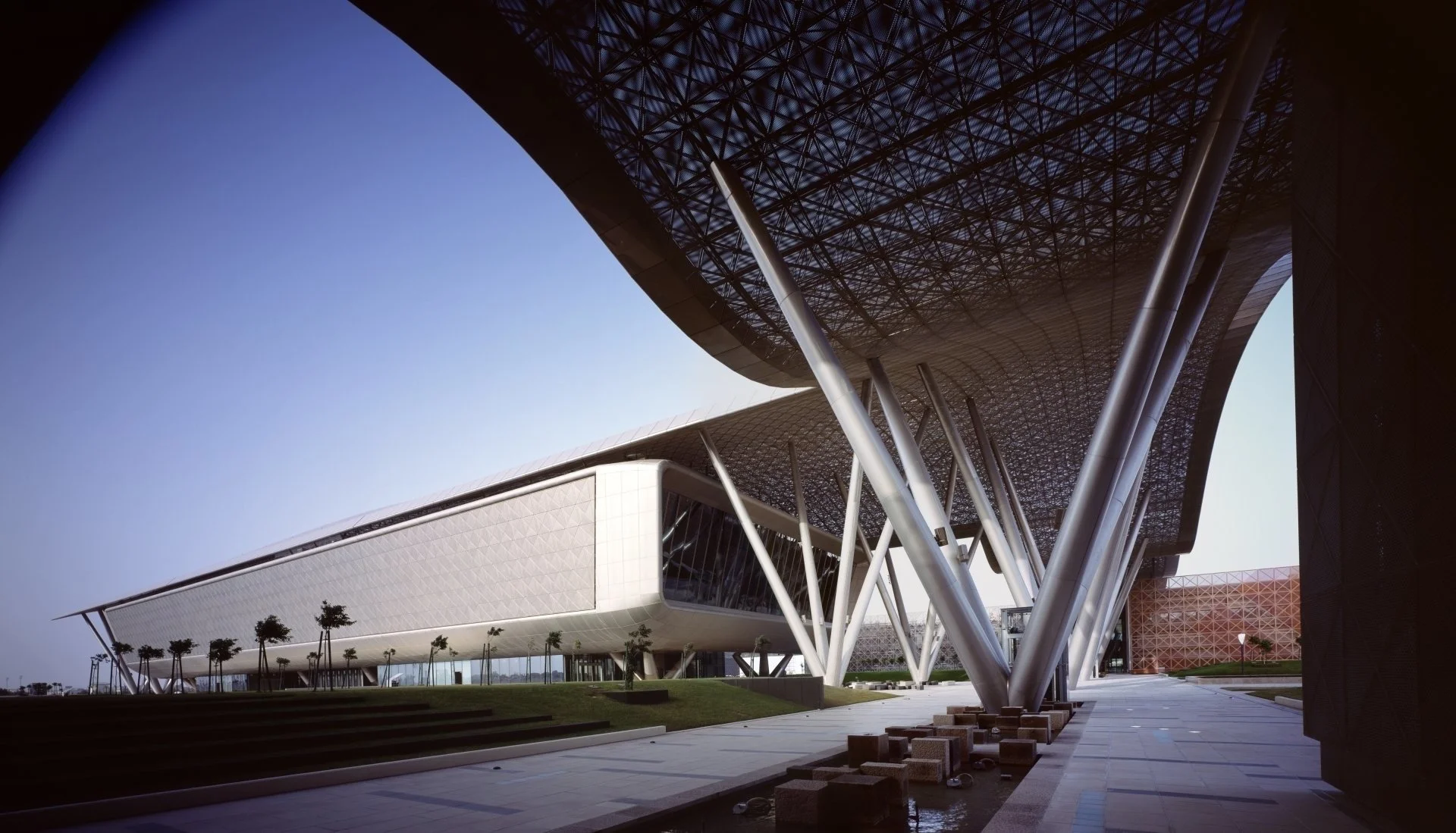
Qatar Science and Technology Park (QSTP) is an integral part of Qatar’s National Vision 2030 which aims, through sustainable development, to transform Qatar into one of the world’s most advanced economies within two decades.
QSTP represents a new master plan concept for science and technology parks worldwide. As a home for technology-based companies from around the world,
and an incubator of start-up enterprises, QSTP is set to become a major contributor
to the development of Qatar’s economy.
Solution
The brand required a animated scientific look and feel representing the investigative mind fostering the brightest minds in their fields across innovation, research and entrepreneurship in the region and beyond! To be an international hub for scientific
and technology innovation, tech-based entrepreneurship and high-tech businesses. Support tech-based entrepreneurship ventures in Qatar through incubation, funding, training, mentoring, and connection to the regional and global tech innovation ecosystem. Accelerate product innovation within the private sector through programs and grants that encourage new product development, innovation and collaboration with QF’s research institutes. Create an environment that fosters innovation and collaboration by attracting and supporting tenants focused on development of tech-based products and services and the commercialization of scientific research.
Urban Lifestyle
Independent Boutique
Client
Smock
Region
EIRE > Europe
Project
Identity Refresh
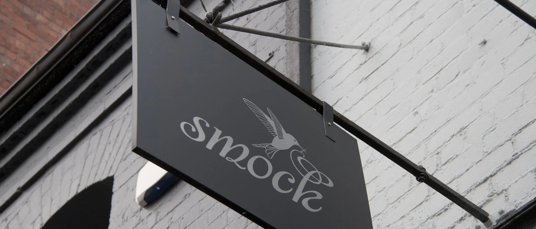
Overview Drury Street, Dublin is home to some of the most brows able windows in the city center, featuring antique diamonds, pastel hued macaroons and independent fashion boutique, Smock. With a niche clientele, Smock approached us to design an identity that felt bespoke. An elegant hummingbird became their motif, carefully embroidering flowing lettering on store fronts and packaging that feels as special as the garment inside. Since opening their shop on Drury Street, Smock have featured in Vogue magazine as part of an insiders guide to the best fashion finds in major cities. The Smock identity has also featured in Logo Lounge, a book many designers are familiar with as a go-to reference for great new identities worldwide each year.
Spatial Intelligence
East meets West
Client
Cantieri
Region
MENA
Project
Identity Creation
Context Cantieri Projects is a new interior design firm
Challenge
High quality European standards for the Gulf region
Cantieri specialize in commercial and residential developments, while they are also suppliers of high quality European material and furniture. Their business is based in Qatar, they are active in Europe and especially Italy. Created a strong and unique brand that has a credible face as they prepare to intercept a competitive market. Branding that required a local touch, with an international feel.
Solution
Sophisticated, elegant and credible; the clean, geometric shapes and lines are inspired by Arabic geometric patterns, whcih reflects the nature of Cantieri’s design process. Graphite grey, for a modern touch, a hint of aqua to signify the location within the Persian Gulf, and copper foiling forms a modern colour palette. Carefully selected paper helps to fully encompass a refined and structured look.
Alphabet of taste
Premium City Shopping
Client
Azbuka Vkusa
Region
Russia
Project
New Identity
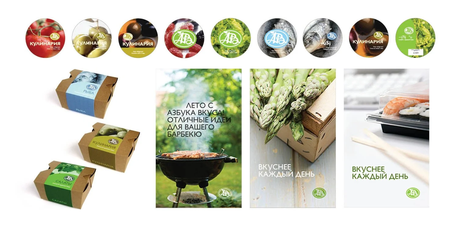
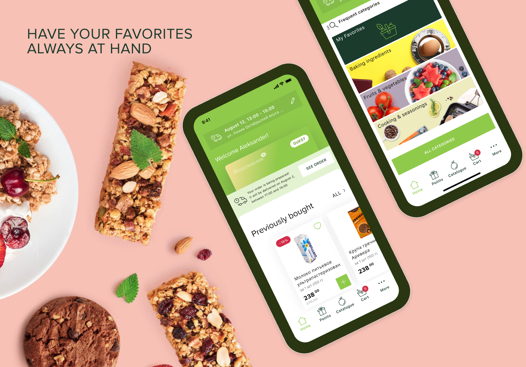
the supermarket chain 'Azbuka Vkusa' specializes in high-quality food and alcohol. This is one of the oldest Russian retail chains, aimed at both gourmets and those who appreciate good food. 'Azbuka' supermarkets also offer cooked food for takeaway, business menu, sushi, freshly baked bread and eco products.
The company has opened more than
60 supermarkets all over the Moscow, Moscow region and St. Petersburg. It works with more than 900 manufacturers from
70 countries.
Millennium Readership
Leading Arabic Newspaper
Client
HIWAR
Region
Kuwait > MENA
Project
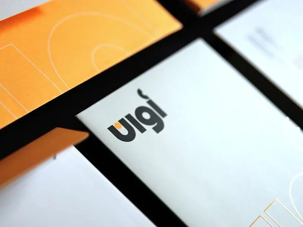
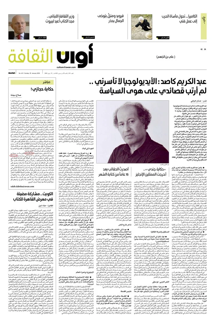
Awan Daily Newspaper
(Brand Identity and Editorial Design)
Context
HIWAR: Redefining Arab Press. Imposed since the mid-1970s, the ban on issuing licenses for new newspapers had led to a stagnation in the field of media development. The new press law revamped the licensing system so that new publications can be established. Hiwar established Awan daily Arabic newspaper to be the leader in objective news reporting and in-depth opinion. The newspaper needed to be more than just another Arabic newspaper brand and editorial informative piece of communication that is multifaceted. It had to convey a new way of thinking, in terms of Arabic newspaper design content, and to differentiate itself in a race with established and freshly launched newspapers in Kuwait, where some have already extended their brand into broadcast, providing more information.
Challenge
The newspaper needed to be more than just another Arabic newspaper brand and editorial informative piece of communication that is multifaceted. It had to convey a new way of thinking, in terms of Arabic newspaper design and content, and to differentiate itself in a race with established and freshly launched newspapers in Kuwait, where some have already extended their brand into broadcast, providing more than just information.
Solution
Pushing the limits of Arabic newspaper design and layout by working a custom and modern typeface for the headlines and establishing a masthead. Adaptation of a vertical grid allowed the newspaper to stand out on newspaper stands and distribute information in an orderly fashion, rather than the traditional puzzle-like layout that exists in the industry, bringing a fresh look and content to the Arab press and becoming a benchmark in its own right.
We raised the level of Arabic newspaper design by working a custom and modern typeface for the headlines and establishing a masthead. Adaptation of a vertical grid allowed the newspaper to stand out on newspaper stands and distribute information in an orderly fashion, rather than the traditional puzzle-like layout that exists in the industry, bringing a fresh look and content to the Arab press and becoming a benchmark in its own right.
Elite Sport Investment
Sport Diplomacy
Client
Qatar Sports Investment
Region
MENA > Europe
Project
Brand Identity
Overview
This strategy can be divided into four major pillars:
1) the direct investment into sport industry;
2) the hosting of major sports events;
3) elite sport development
4) sport diplomacy. The first pillar is that of the direct investment into sport industry.
Challenge
By participating in a sport, QSI is making a social statement about who they are and how they want others think of them.
Solution
An athletic identity is developed through acquisition of skills, confidence, and social interaction during sport. It plays a part in a cognitive and social role.

